Clearspace
One stem width (X) on every side of every lockup, built into every file. Nothing enters it.

Brand system · final identity
Destination Tshwane is one idea, convergence, made into one mark, one lockup, one colour system and one typeface. Everything here is generated from the canonical master files; nothing is redrawn.

01 / The master and the lockups
brand/master · brand/logo-suite
The approved Y is the single source of truth. It was checked against the original artwork: 97.9% overlap, largest deviation 2.2 units of 500, the soft edge of the original raster. One reconstruction error, the gold arm’s inner edge, was corrected to match; nothing else changed.











One stem width (X) on every side of every lockup, built into every file. Nothing enters it.
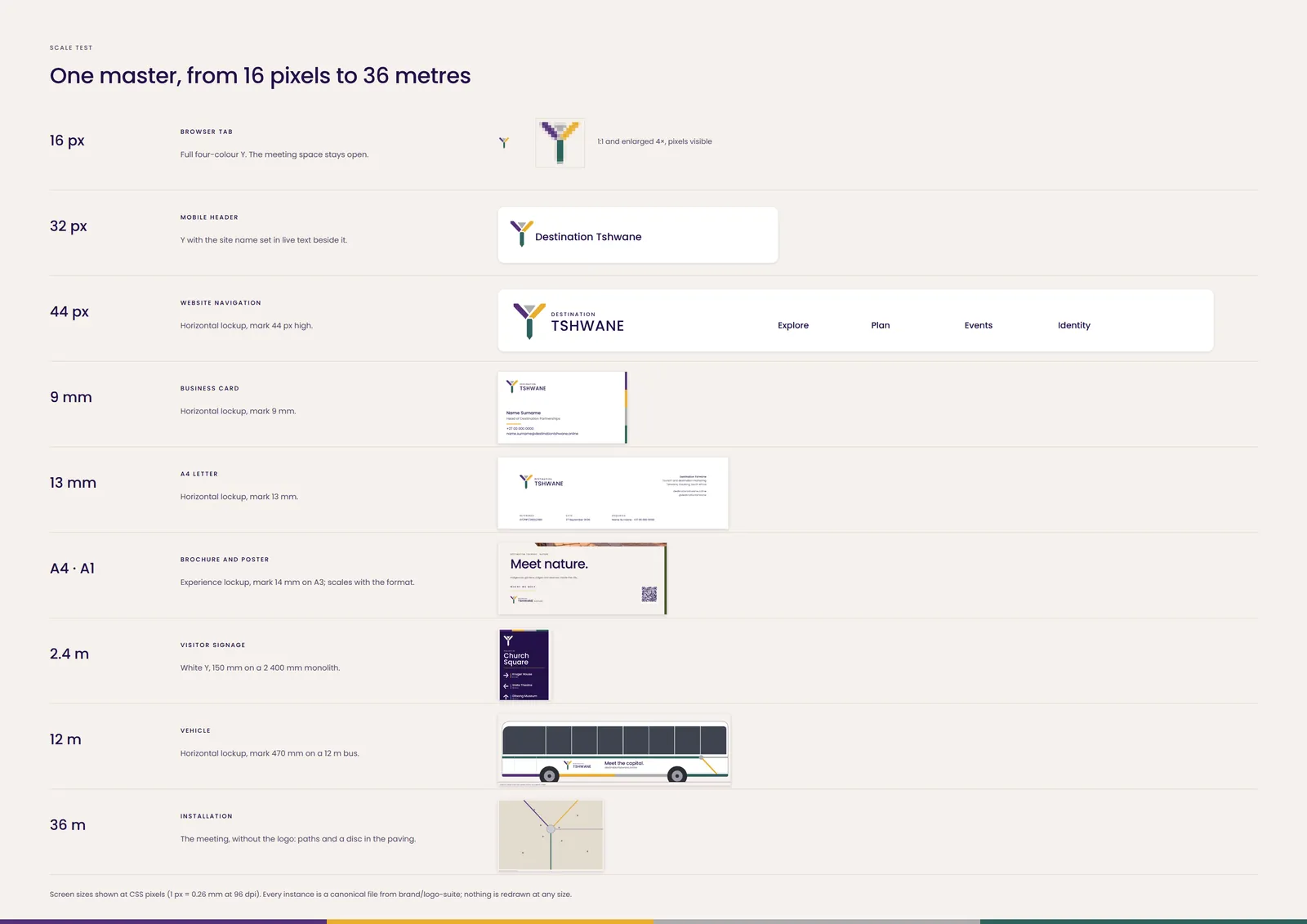
Y-only 5 mm tall / 16 px tall · Primary 30 mm wide / 160 px wide · Vertical 25 mm wide / 140 px wide · Horizontal and secondary 40 mm wide / 130 px wide · Compact 35 mm wide / 200 px wide · Payoff 30 mm wide / 160 px wide · 30 Years 40 mm wide / 180 px wide · Experience lockups 60 mm wide / 240 px wide. Minimums keep the smallest words (DESTINATION, the payoff, experience names) at about 1.3 mm cap height in print. Below a minimum, switch to the next smaller lockup; below the compact, use the Y alone.
Full colour on white, cream and stone only. On purple, green, night or photography use the white lockup. Purple on deep purple is 1.7:1 and is never used.
Primary → secondary → horizontal → compact → Y-only as space shrinks. Never scale a larger lockup below its minimum; switch to the next.
02 / Colour
Core, neutral and thematic
The core colours come from the approved 30 YEARS artwork and name the parts of the Y. No cultural or flag meaning is attached to them. CMYK values are ICC conversions to FOGRA39 (coated); Pantone matches are to be made physically against a press proof, so no Pantone numbers are asserted here.
Primary brand colour. Headings, large colour fields, dark grounds.
Arrival and action: highlights, rules, calls to action on dark grounds. Never for text on light grounds.
Neutral common ground: dividers, meeting points, quiet fills. Never for text.
The continuing path: secondary dark grounds, wayfinding direction, text on light grounds.
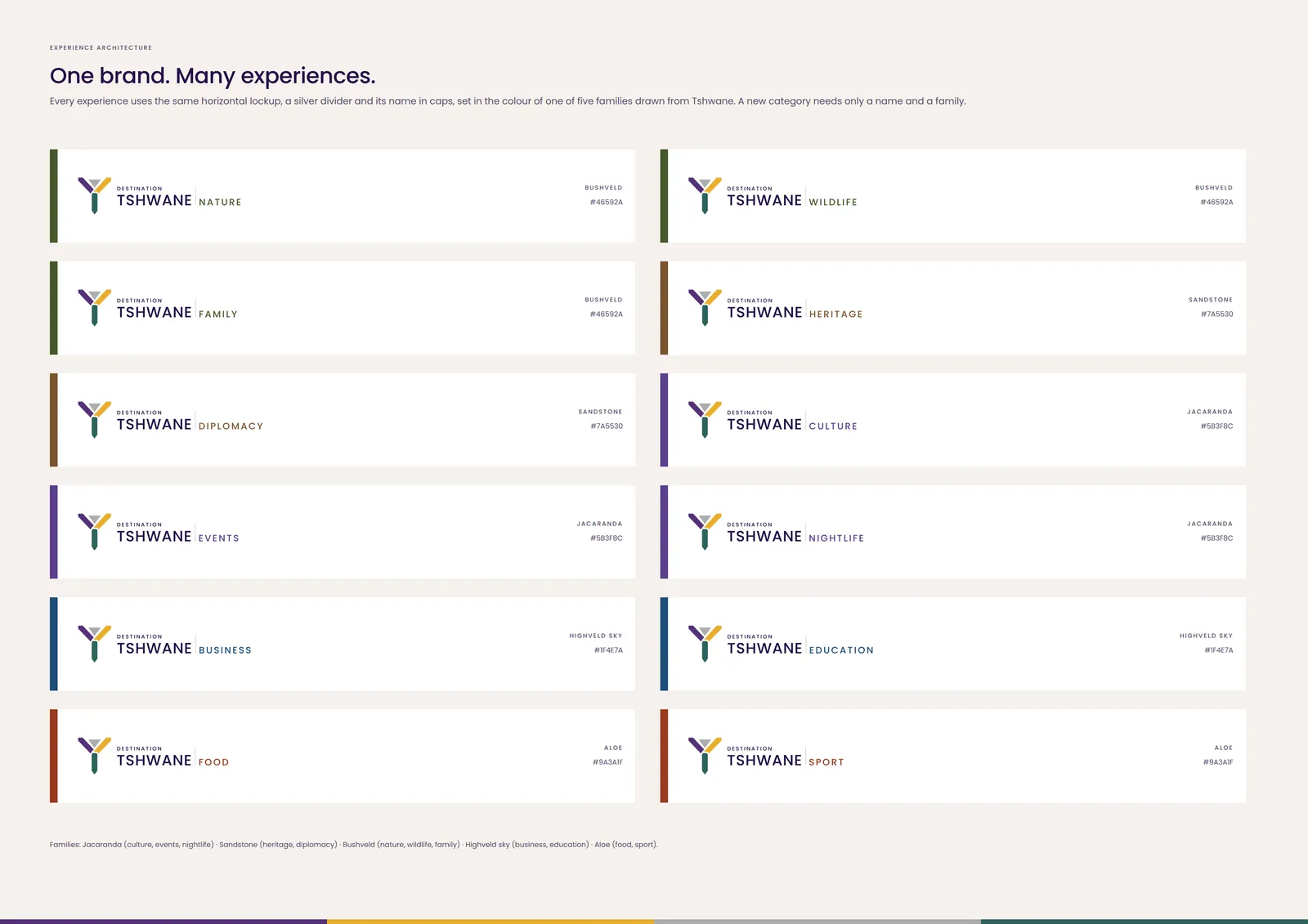
Five families from things visitors see in Tshwane, each with a text-safe deep tone, a mid tone for fills and a light tint. They mark experiences; they never replace the core colours or appear in the Y.
| Family | Drawn from | Experiences | Deep (text, bands) | Mid | Light |
|---|---|---|---|---|---|
| Jacaranda | Tshwane’s jacaranda season, from late September into November and peaking in October: the city’s best-known visual moment. | Culture, Events, Nightlife | #5B3F8C · CMYK 79 88 0 10 7.4:1 on cream · text-safe | #8E6BBE CMYK 56 64 0 0 · fills and icons only | #E9E0F4 CMYK 11 13 4 0 · backgrounds |
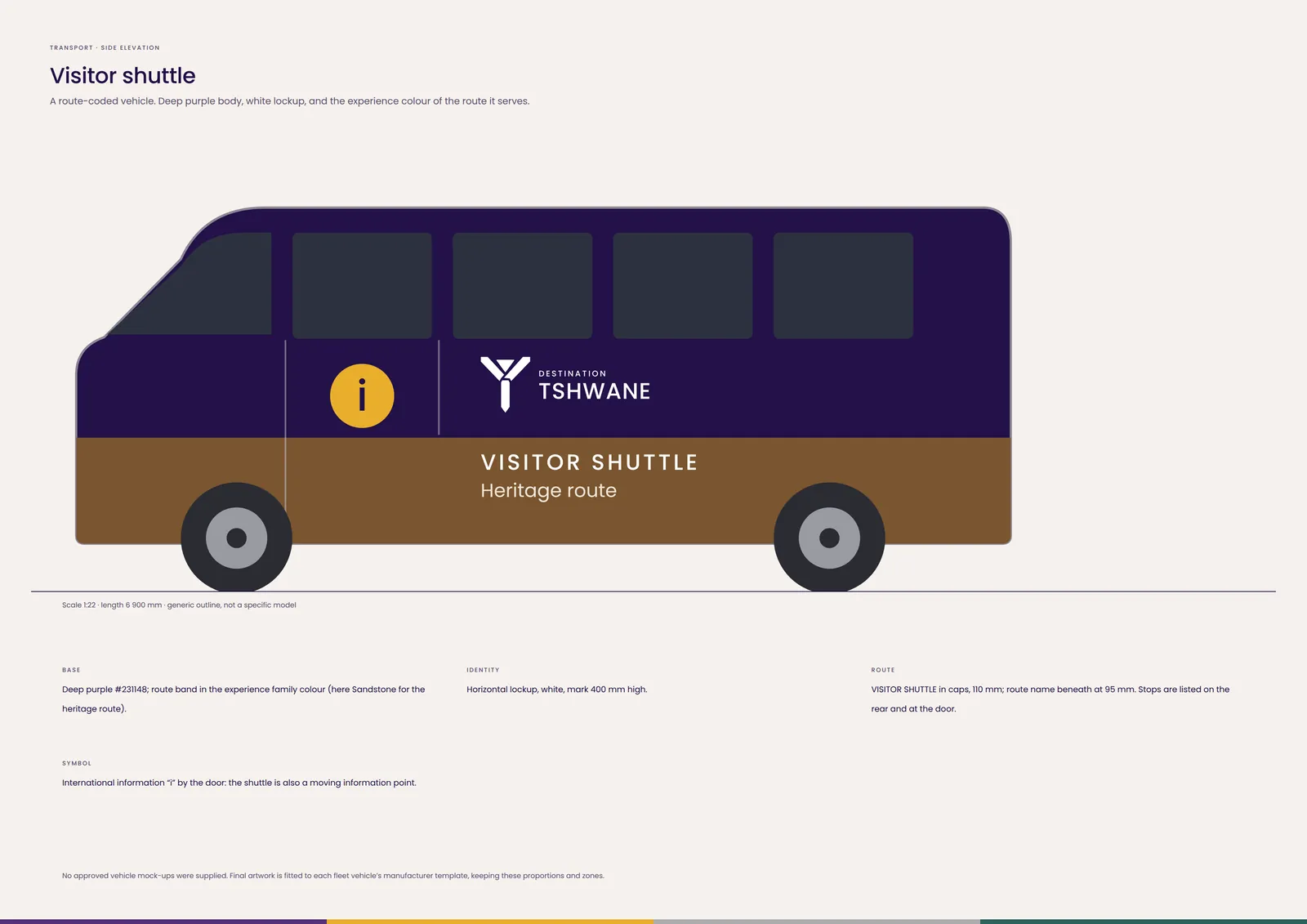
| Sandstone | The sandstone of the Union Buildings and the granite and stone of the city’s heritage architecture. | Heritage, Diplomacy | #7A5530 · CMYK 41 60 92 40 5.9:1 on cream · text-safe | #B8875A CMYK 25 46 69 13 · fills and icons only | #F1E6D8 CMYK 7 10 17 0 · backgrounds |
| Bushveld | Highveld grassland, koppies and bushveld, from the city’s ridges to Dinokeng. | Nature, Wildlife, Family | #46592A · CMYK 59 27 95 58 6.9:1 on cream · text-safe | #7C8F45 CMYK 54 24 87 18 · fills and icons only | #E7ECD9 CMYK 11 5 18 0 · backgrounds |
| Highveld sky | The clear, deep-blue winter sky over the Highveld. | Business, Education | #1F4E7A · CMYK 90 53 4 44 7.7:1 on cream · text-safe | #4F86B8 CMYK 69 34 2 15 · fills and icons only | #E1ECF6 CMYK 13 6 5 0 · backgrounds |
| Aloe | Winter-flowering aloes in the city’s gardens and on its ridges. | Food, Sport | #9A3A1F · CMYK 11 86 96 38 6.2:1 on cream · text-safe | #D9603B CMYK 0 73 82 11 · fills and icons only | #FBE4DA CMYK 5 13 14 0 · backgrounds |
03 / Typography
Poppins · SIL Open Font License
Poppins is the closest open match to the approved wordmark: geometric, flat vertices, a wide W and one stroke weight. The whole system uses Regular 400 and Medium 500, with Light and Bold held back. Its figures are proportional, so tables right-align numbers.
| Role | Specimen | Weight | Tracking | Leading | Case | Minimum |
|---|---|---|---|---|---|---|
| Display | Meet the capital. | Medium 500 | −0.025 em | 1.0 | Sentence case | 40 px / 28 pt |
| H1 | Church Square at first light. | Medium 500 | −0.02 em | 1.05 | Sentence case | 32 px / 22 pt |
| H2 | Three days under the jacarandas. | Medium 500 | −0.015 em | 1.1 | Sentence case | 24 px / 16 pt |
| H3 | Union Buildings | Medium 500 | 0 | 1.25 | Sentence case | 18 px / 11 pt |
| Body | Herbert Baker’s sandstone Union Buildings, completed in 1913. | Regular 400 | 0 | 1.5–1.6 | Sentence case | 16 px / 9 pt |
| Caption | Concept image · to be replaced by commissioned photography | Regular 400 | +0.01 em | 1.4 | Sentence case | 12 px / 7 pt |
| Label | HERITAGE · CHURCH SQUARE | Medium 500 | +0.16 em | 1.2 | Capitals | 11 px / 6 pt |
| UI | Add to my day | Medium 500 | +0.01 em | 1.2 | Sentence case | 14 px |
| Navigation | Explore · Plan · Events | Medium 500 | +0.01 em | 1.2 | Sentence case | 15 px |
| Wayfinding | Freedom Park 35 min | Medium 500 | +0.01 em | 1.1 | Sentence case | 25 mm cap height per 10 m viewing |
| Numerals | 08:00 – 17:00 | Medium 500 | −0.01 em | 1.0 | — | — |
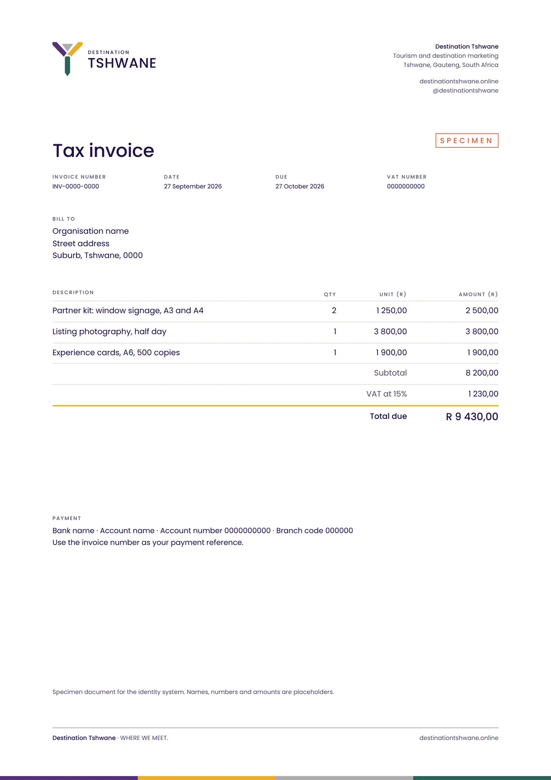
| Data | R 9 430,00 · 12 · 1 250,00 | Regular 400 | 0 | 1.3 | — | 12 px / 7 pt |
| CTA | Plan your day ↗ | Medium 500 | +0.01 em | 1.2 | Sentence case | 16 px |
Body text at least 16 px on screen and 9 pt in print; contrast at least 4.5:1 for text and 3:1 for large text and icons. Gold and silver are never text on light grounds.
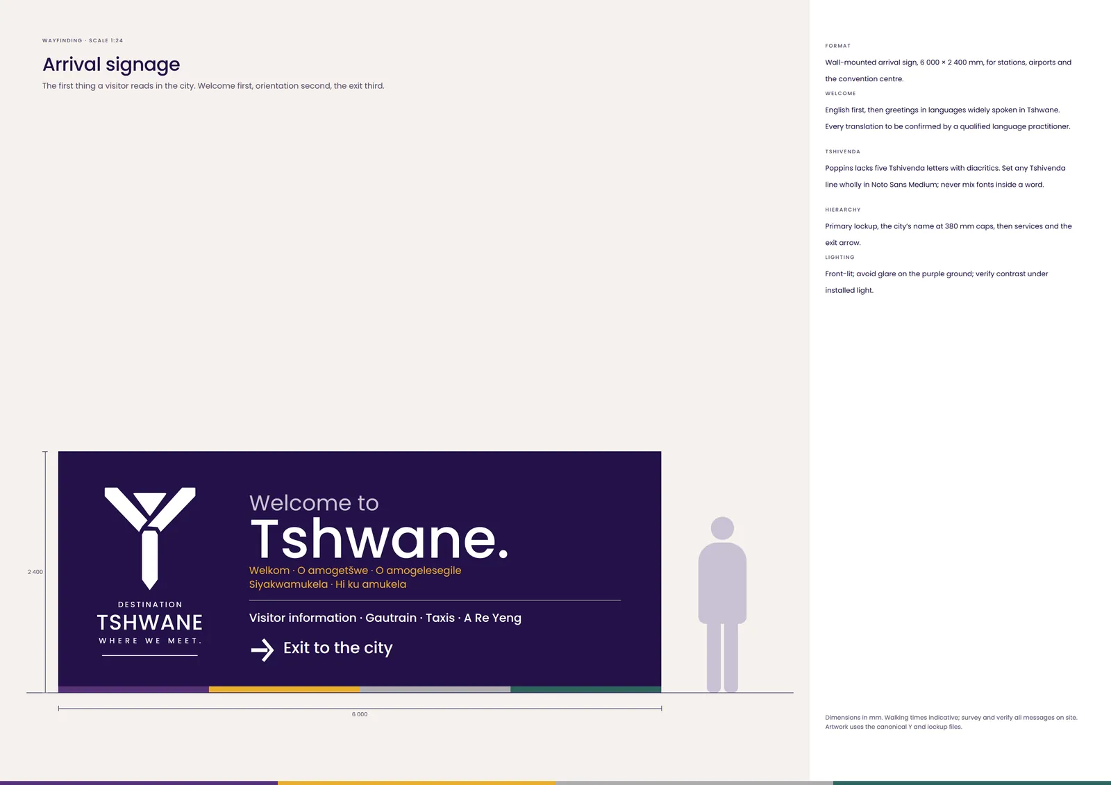
Poppins covers English, Afrikaans, Sepedi (š), Setswana, isiZulu, Xitsonga and the other Latin-script languages used here, but not Tshivenda’s ḓ ḽ ṅ ṋ ṱ. Set a Tshivenda line wholly in Noto Sans; never mix fonts inside a word.
Web: Poppins, then system sans-serif. Office documents: Poppins where installed, otherwise Arial. The files are in the logo suite.
04 / Experience architecture
One brand, many experiences
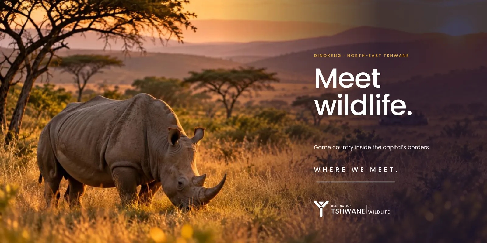
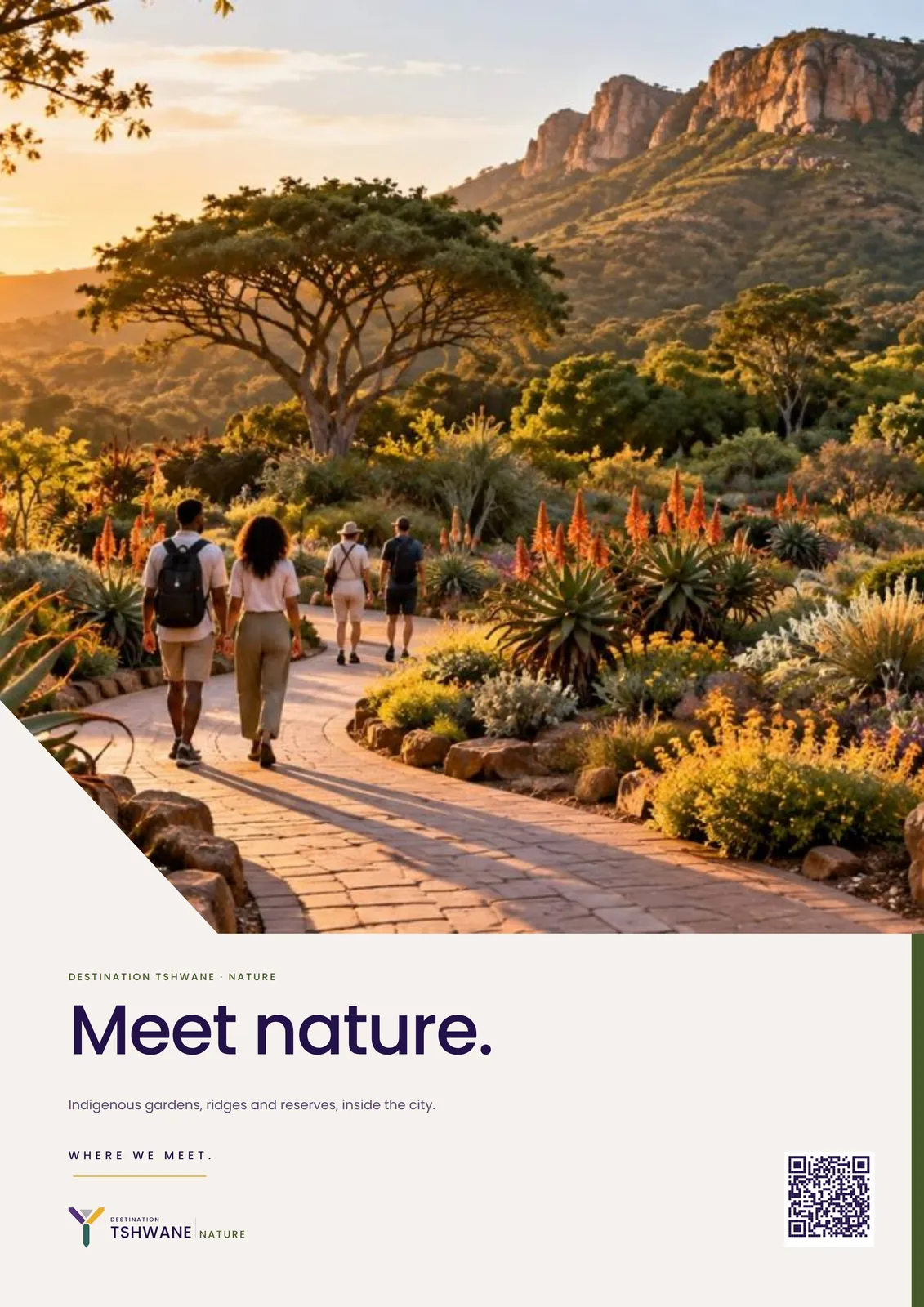
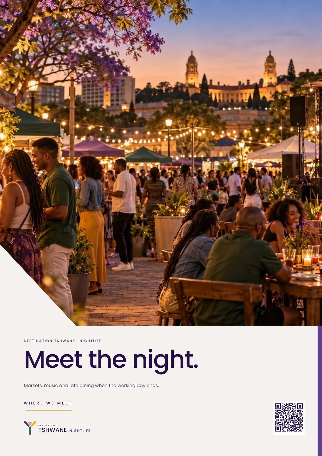
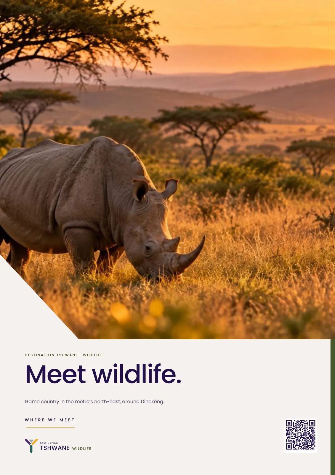
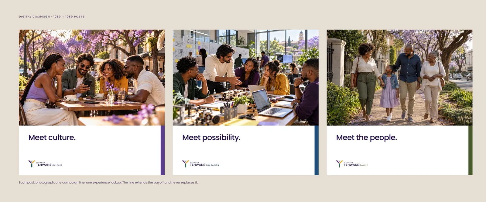
Every experience uses the same horizontal lockup, a silver divider and its name in the colour of its family. A new category needs a name and a family, not a designer. Campaign lines extend the payoff: Meet culture. Meet nature. Meet history. Meet wildlife. Meet the capital. Meet the night. Meet the people. Meet possibility. They never replace Where we meet.











05 / Graphic language and photography
Recognisable without the logo
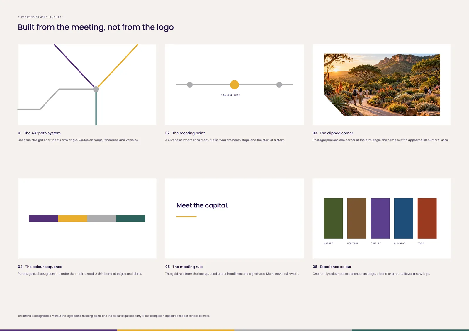
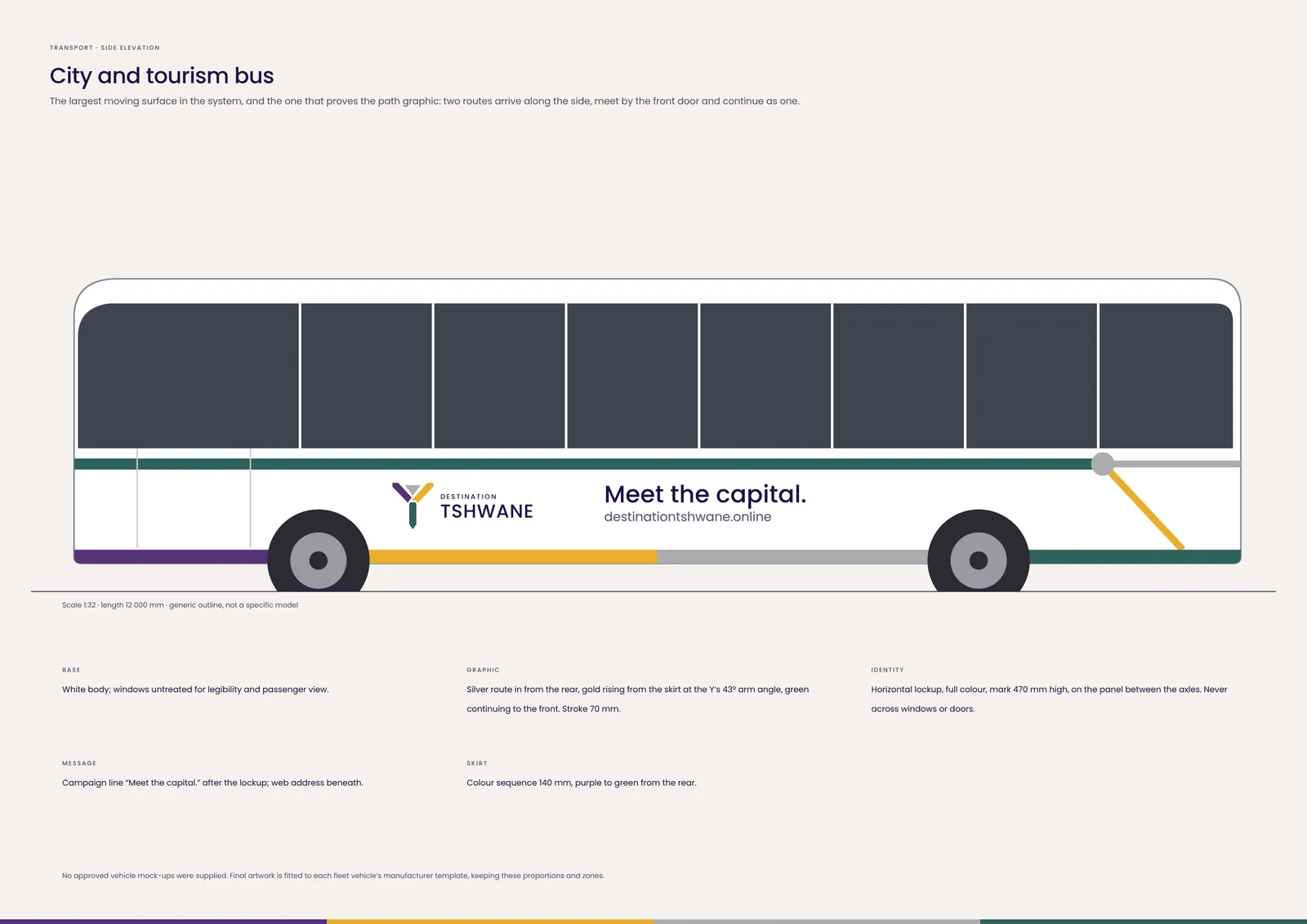
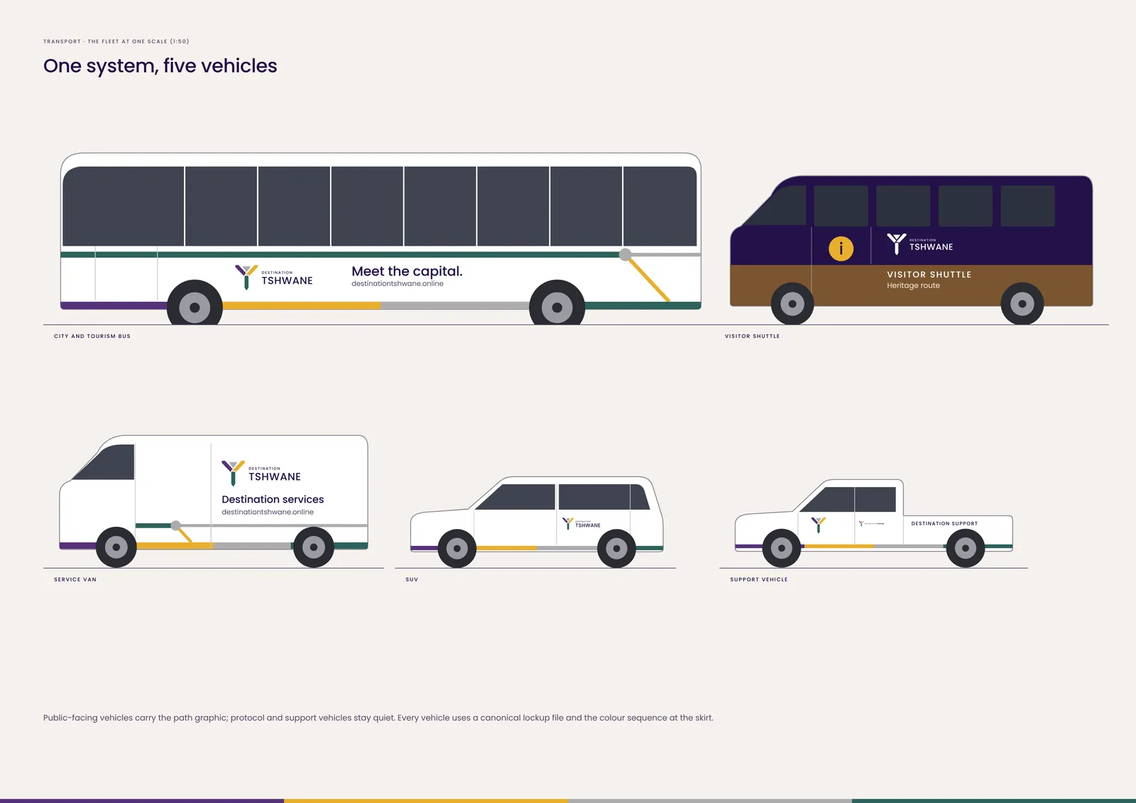
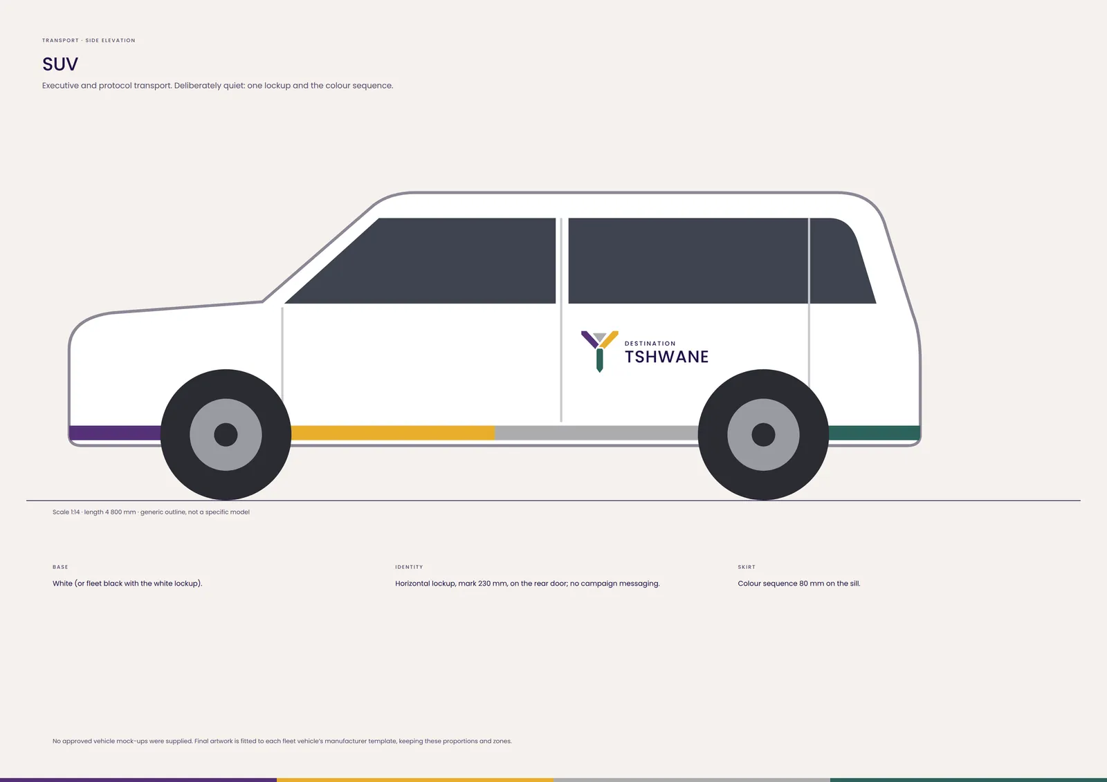
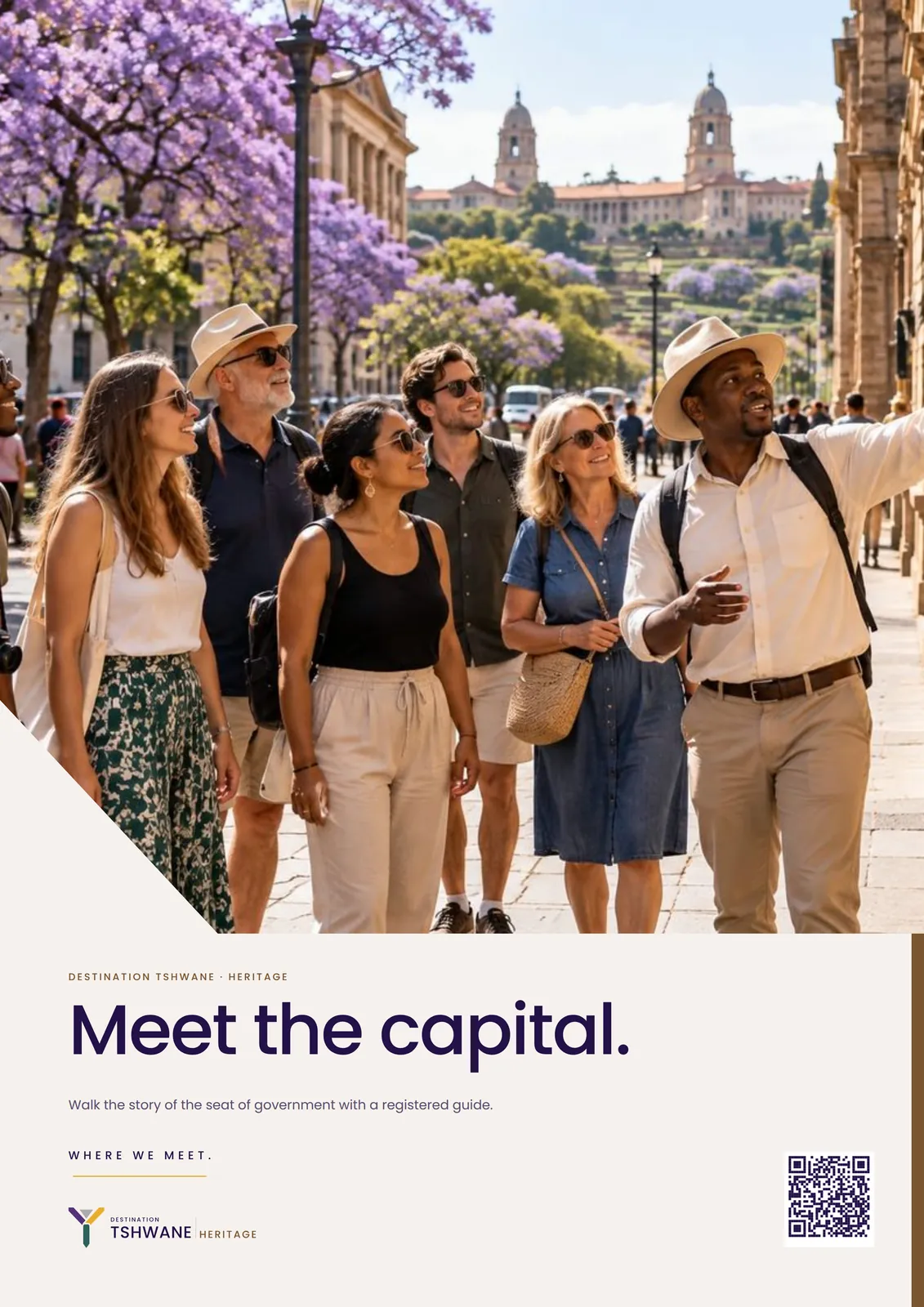
Lines run straight or at the Y’s 43° arm angle and meet at silver points. Photographs lose one corner at the same angle. A thin colour sequence, purple to green, closes edges and skirts. The complete Y appears once per surface at most.
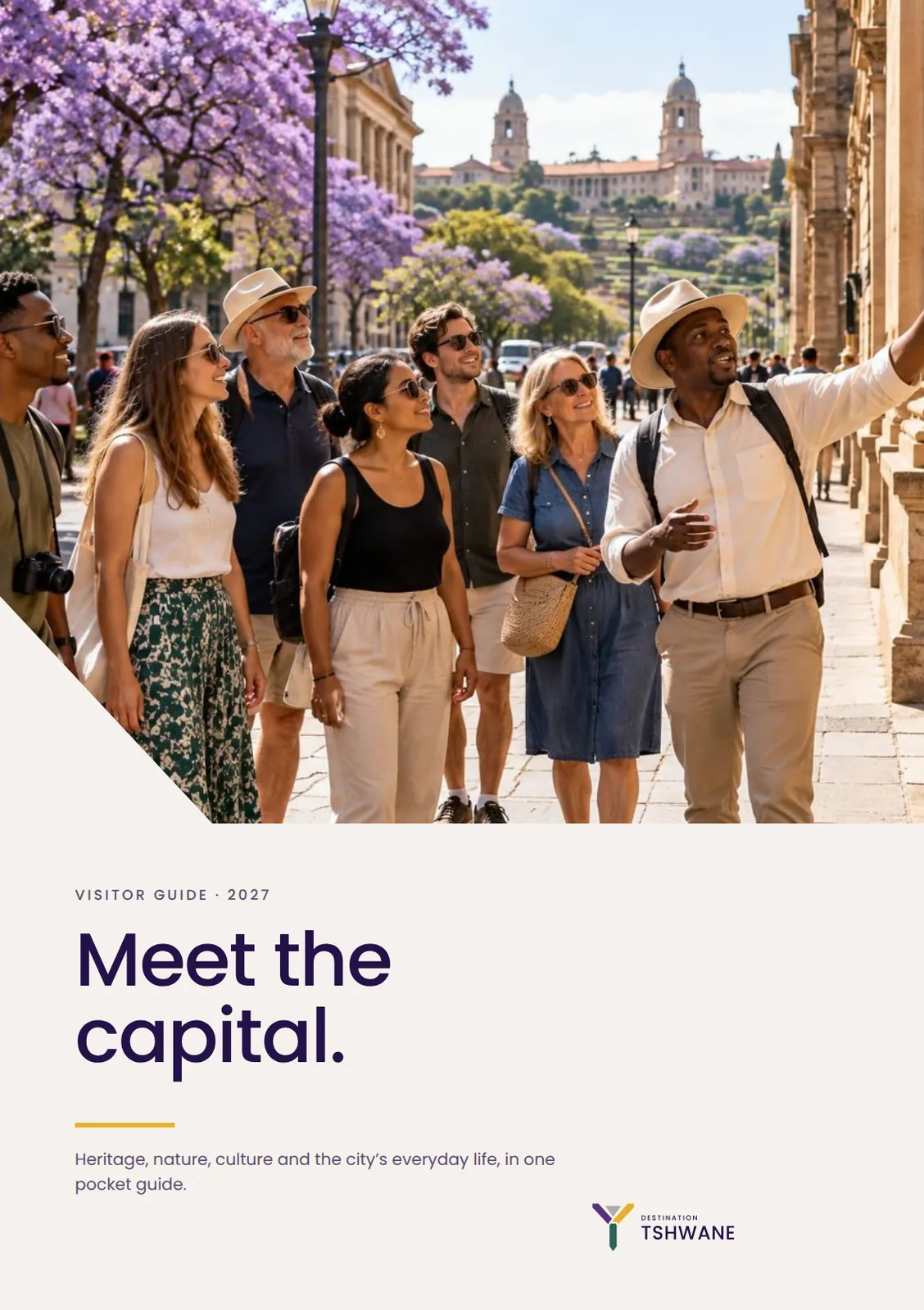
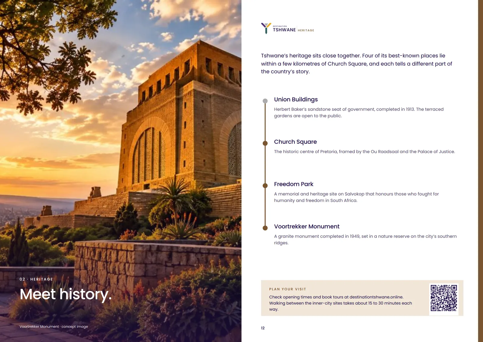
Tshwane first. Brand second. Photography shows real places and people, documentary and warm. Images with invented architecture, fake text, generic skylines or AI-drawn marks are removed. Every photograph in this proposal is concept imagery until commissioned photography replaces it.
06 / Applications
71 artboards · vector PDF in the submission pack
Each piece is built from the canonical logo files and the colour, type and graphic rules above. Names, numbers and events are placeholders; map positions are approximate; walking times are indicative.
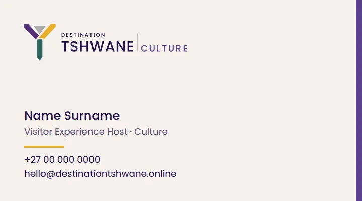
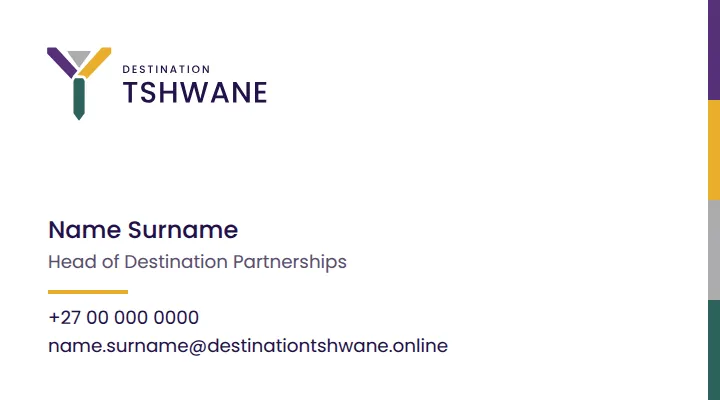
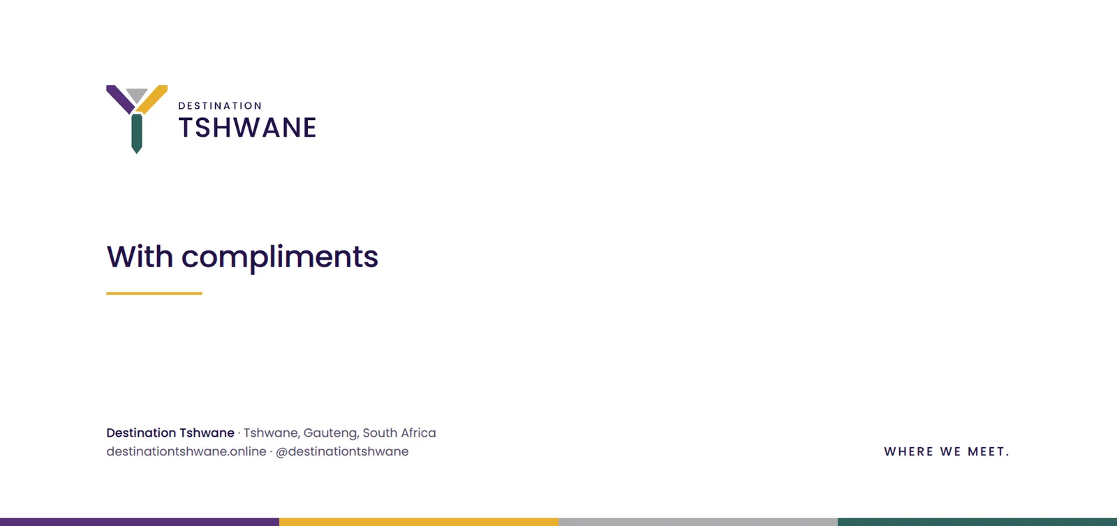
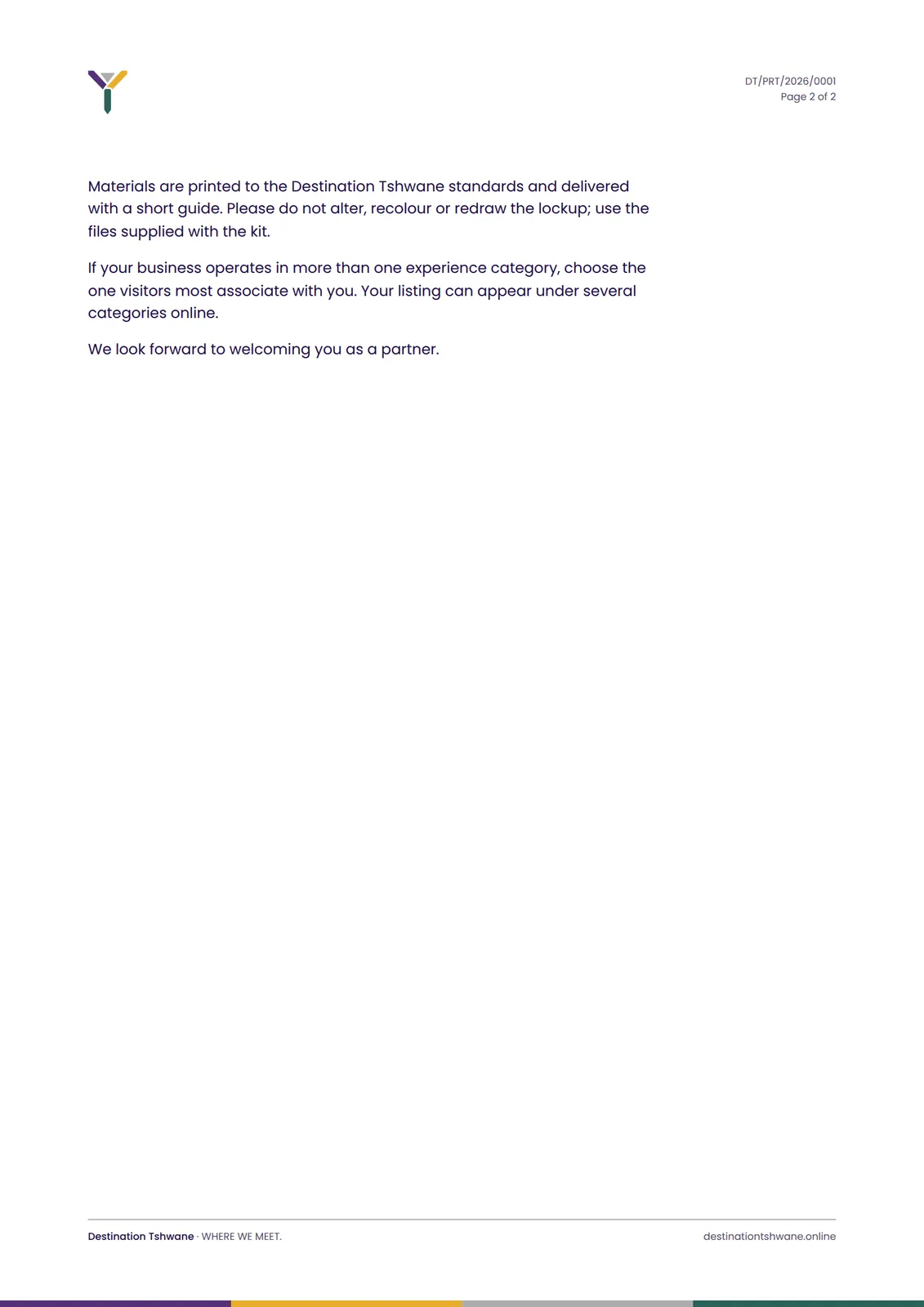
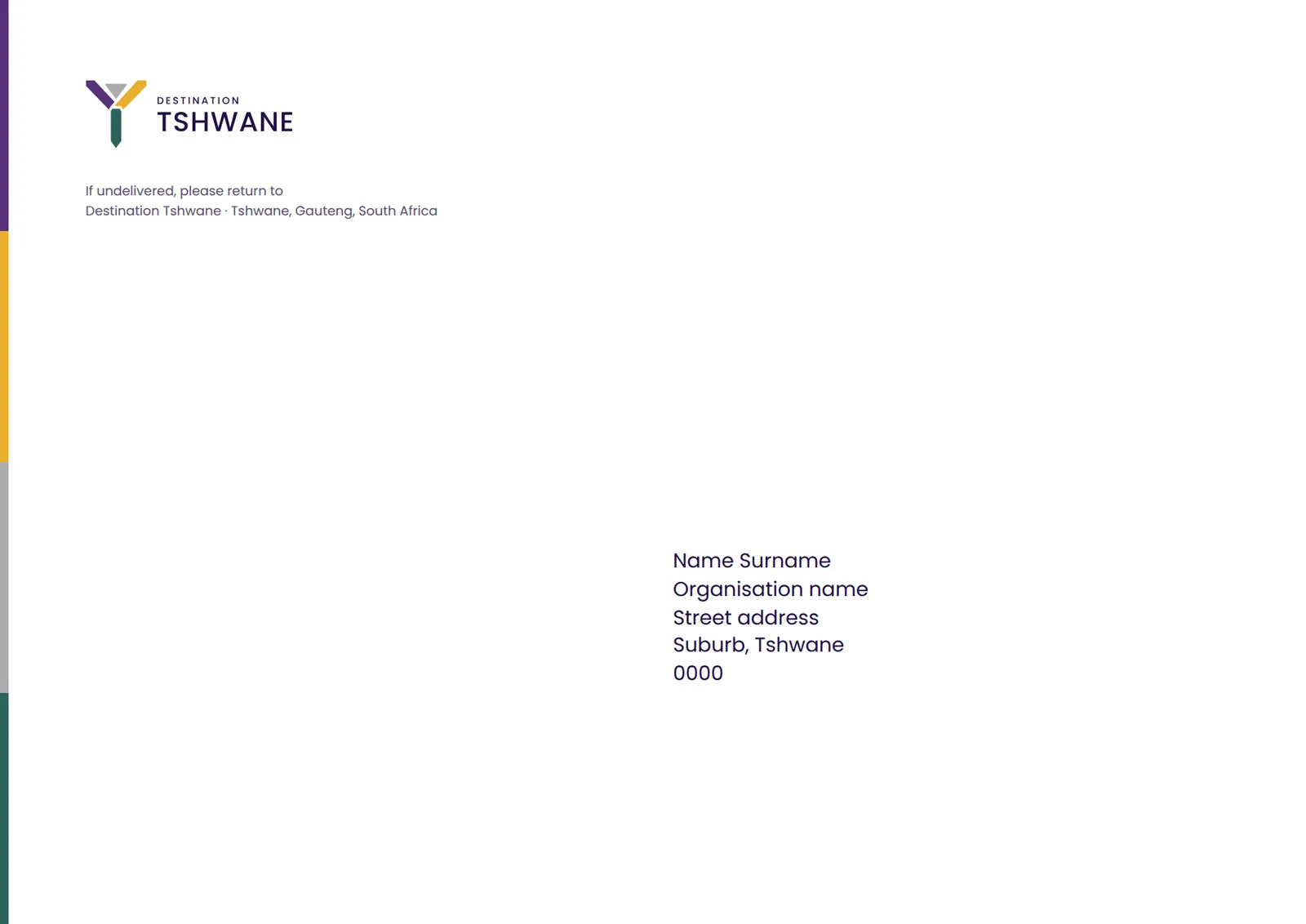
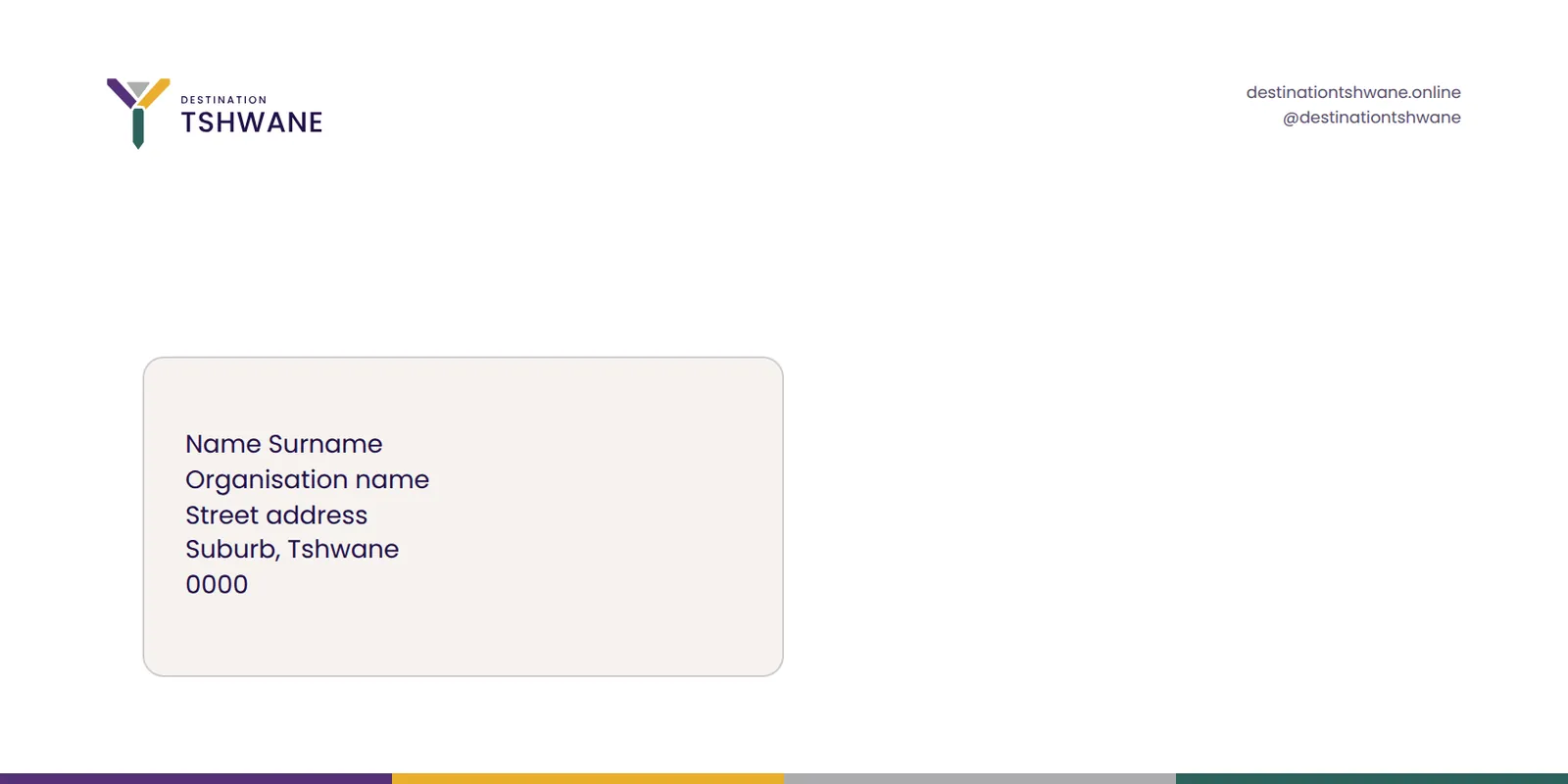
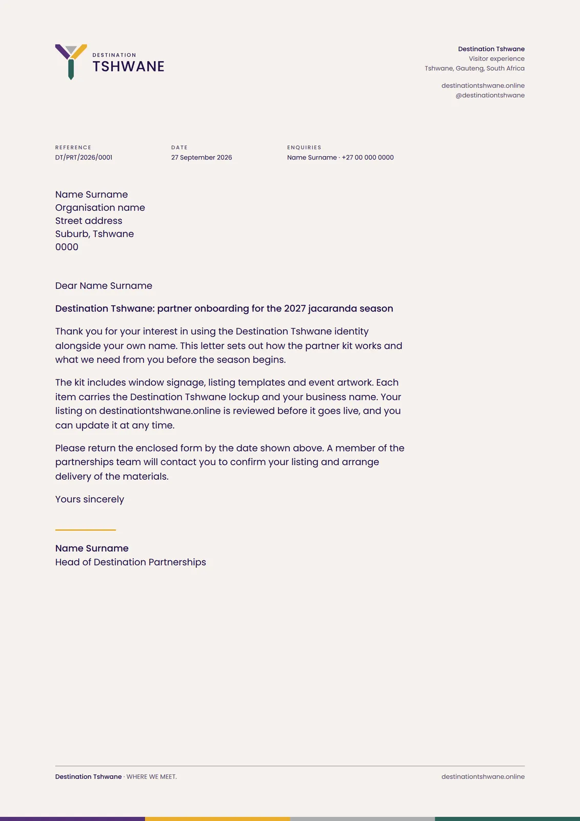
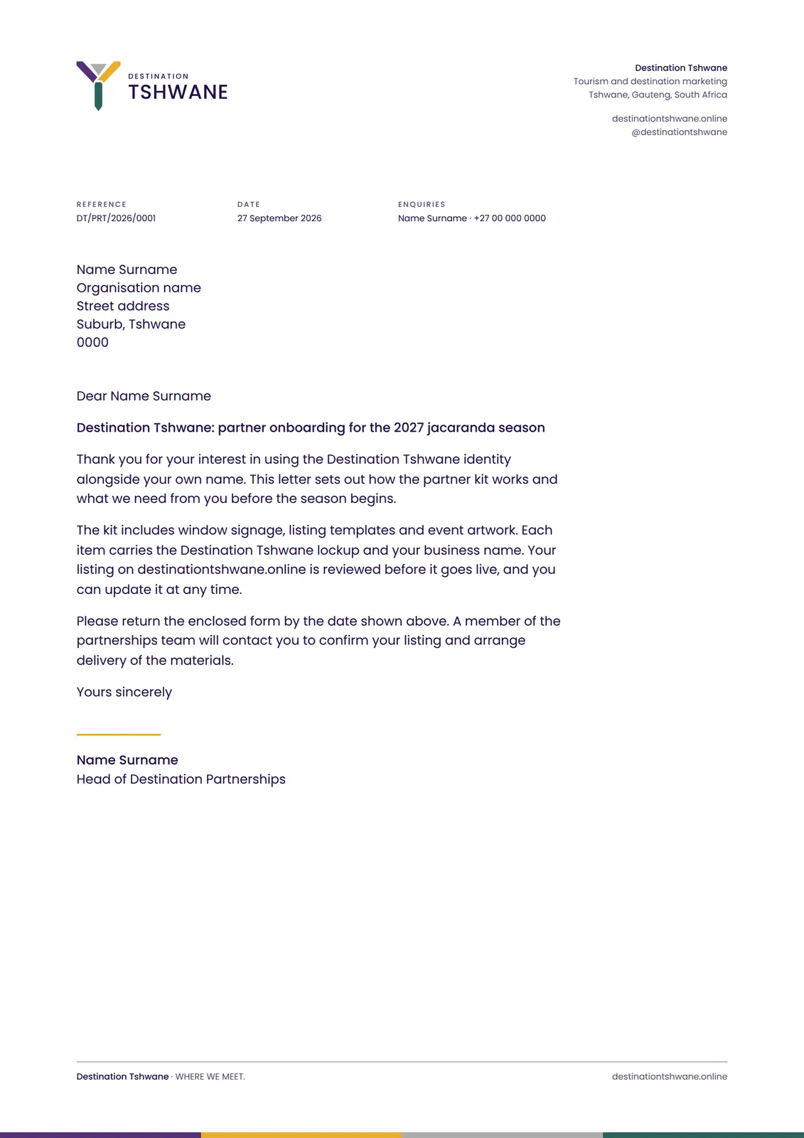
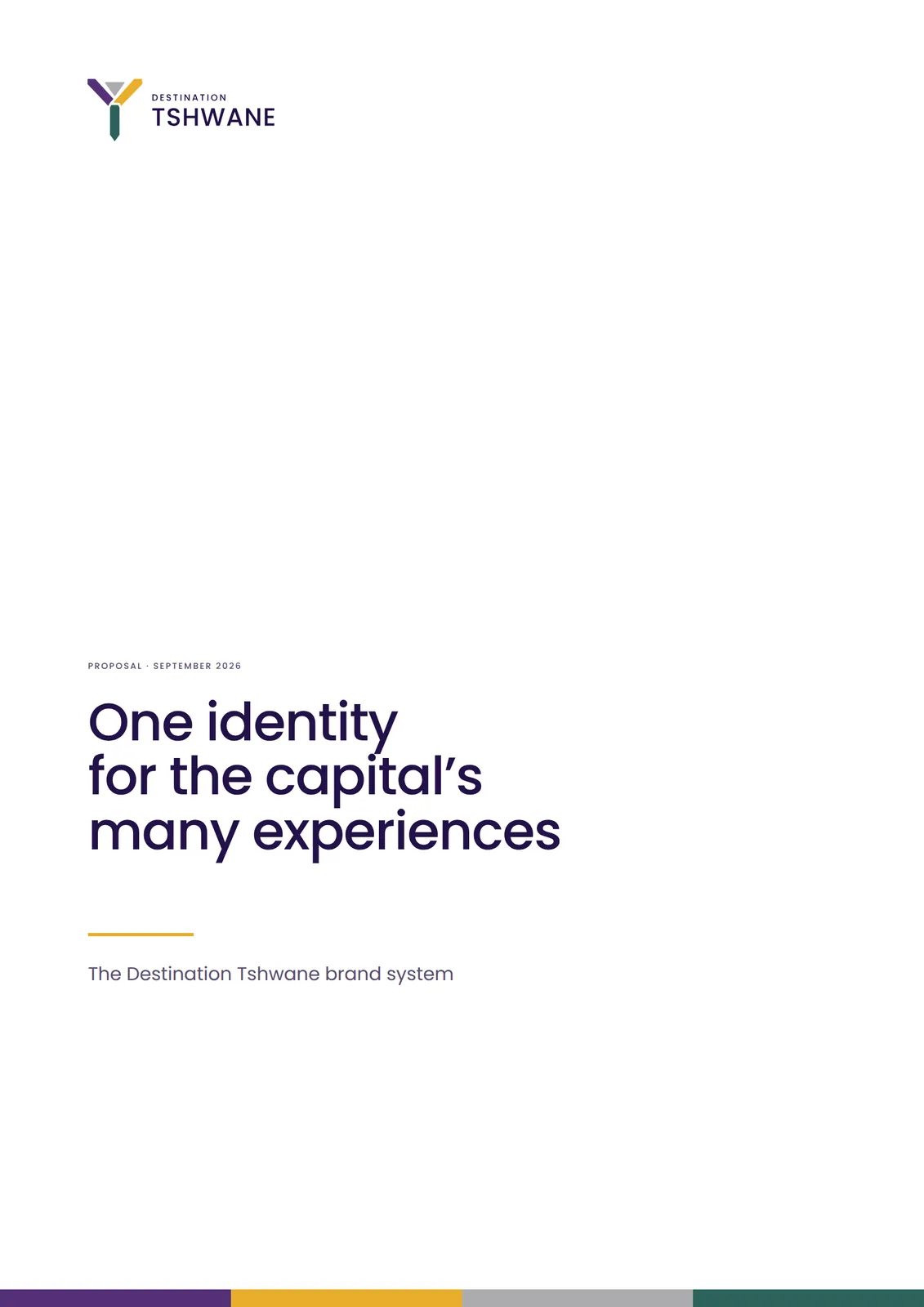
Institutional and destination contexts, from a business card to a media release. Restrained: one lockup, the colour sequence, clear hierarchy.
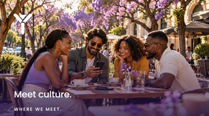


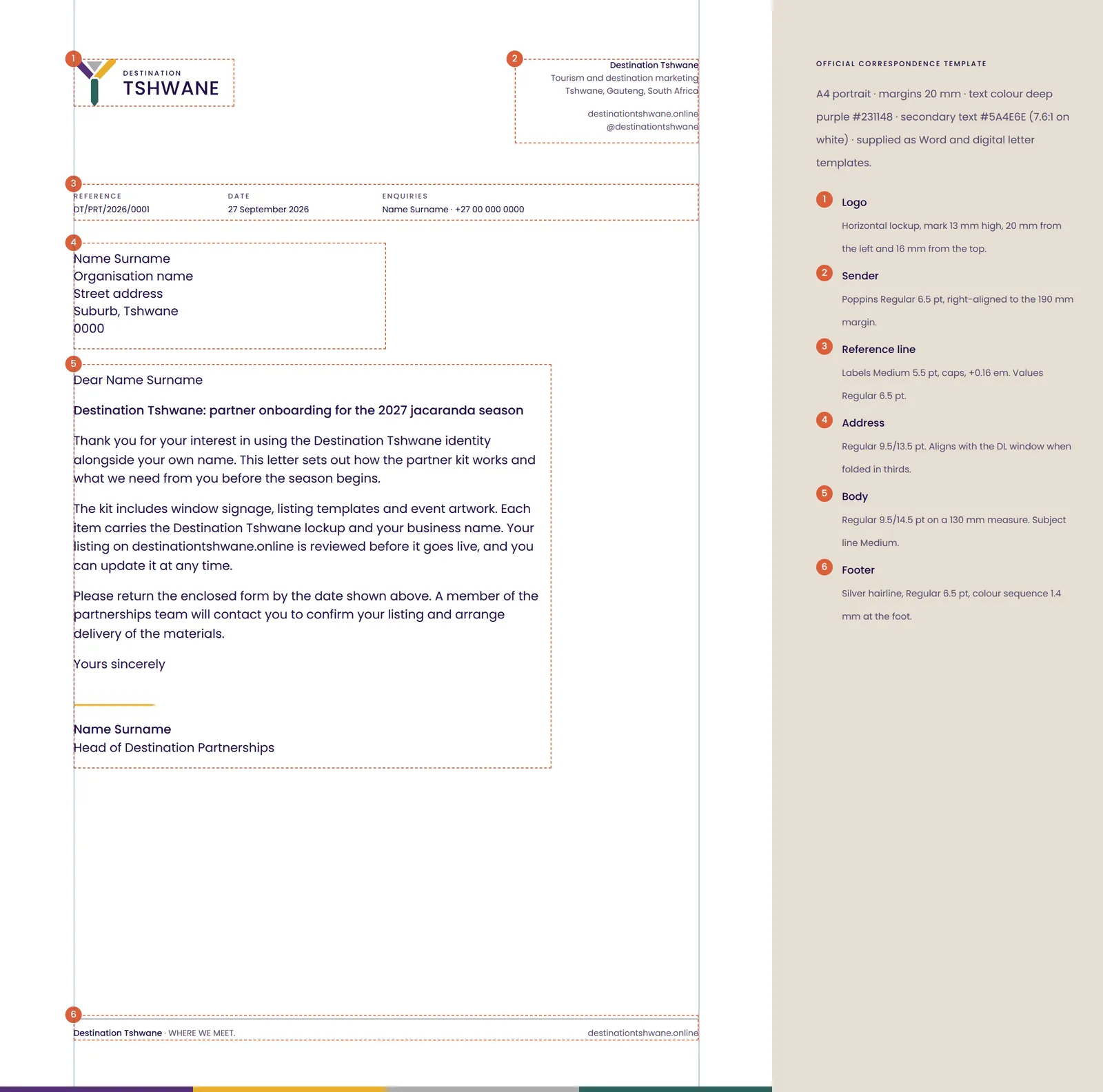
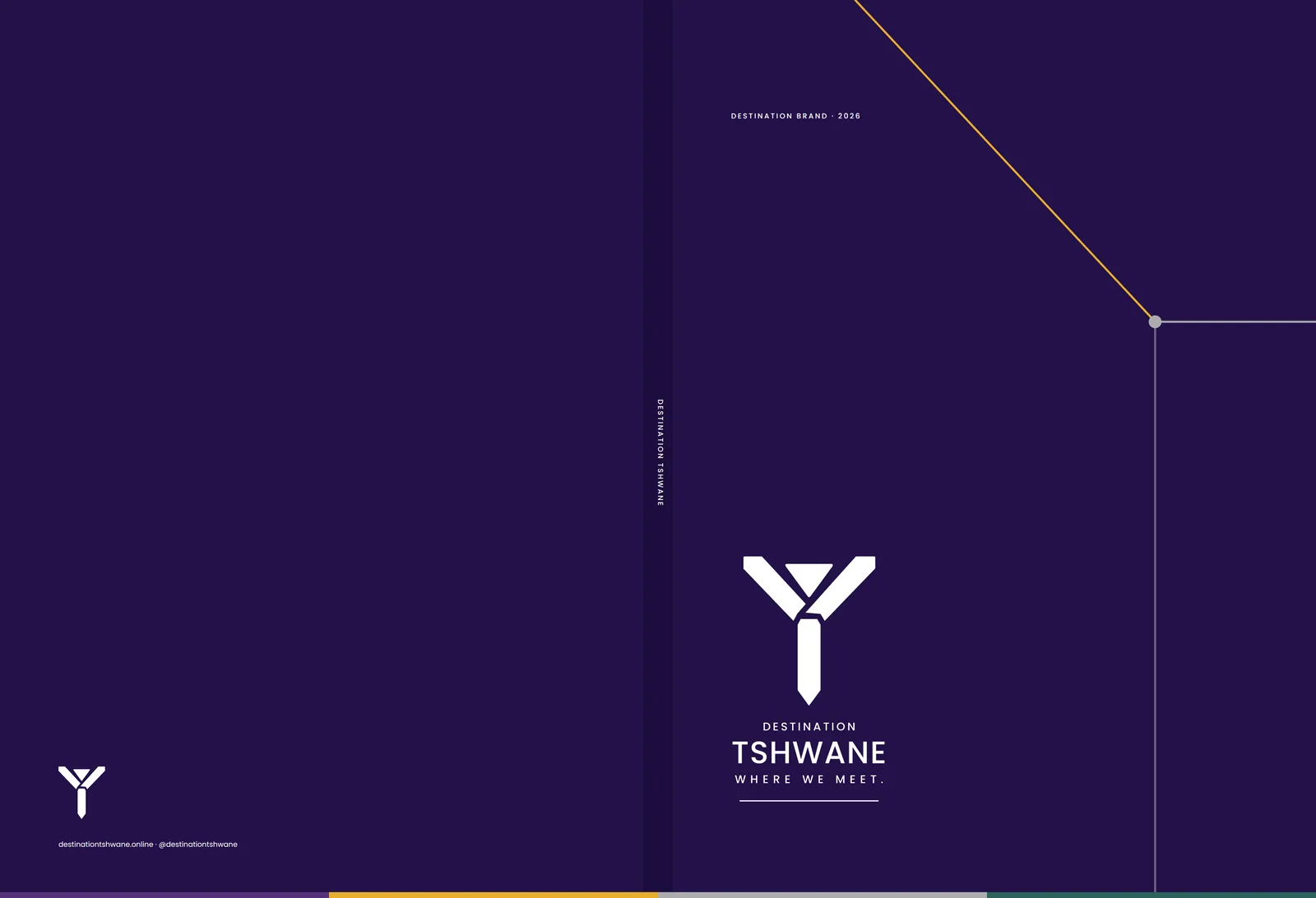
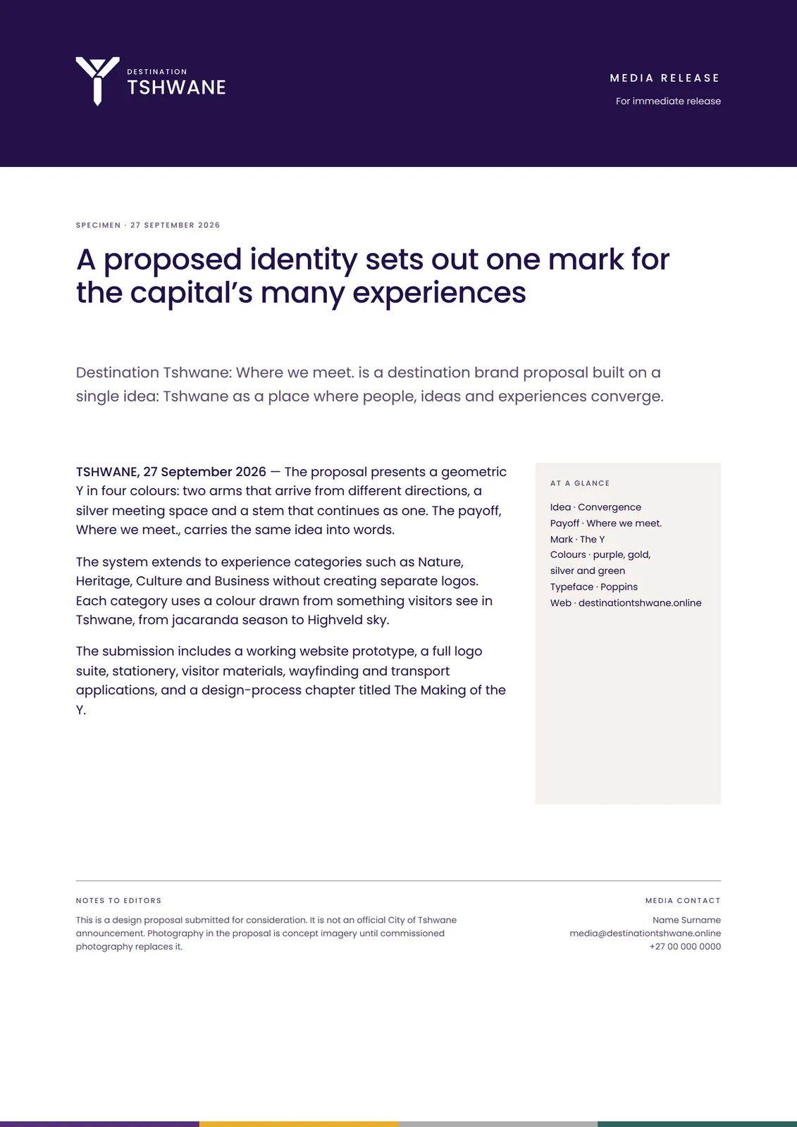
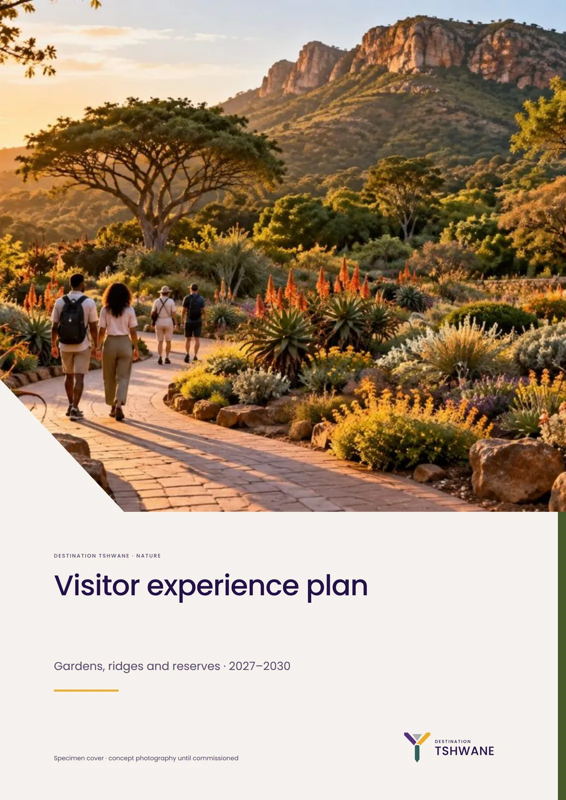
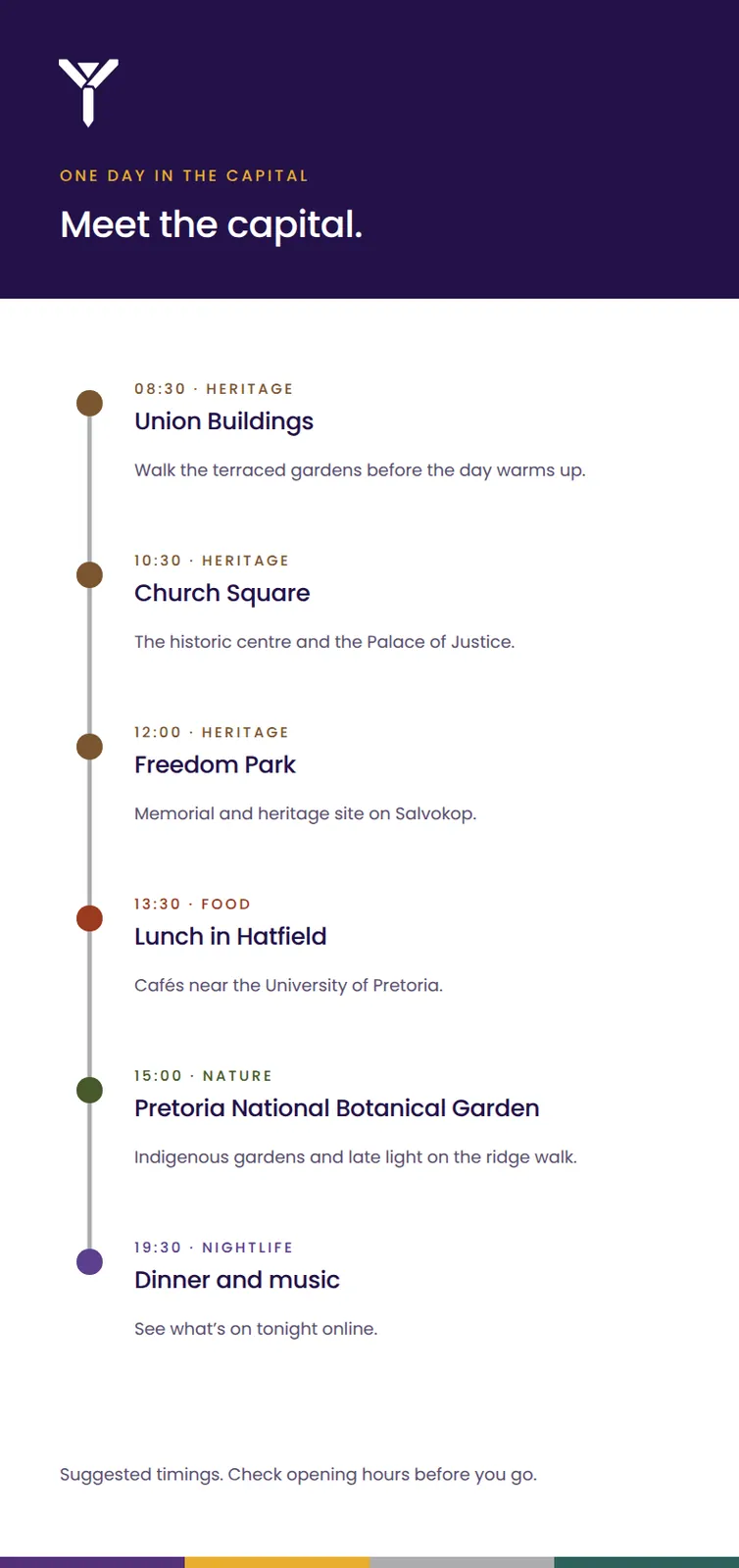
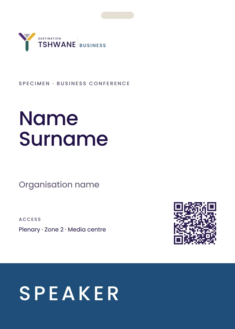
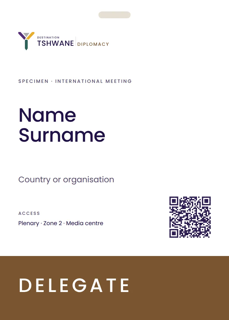
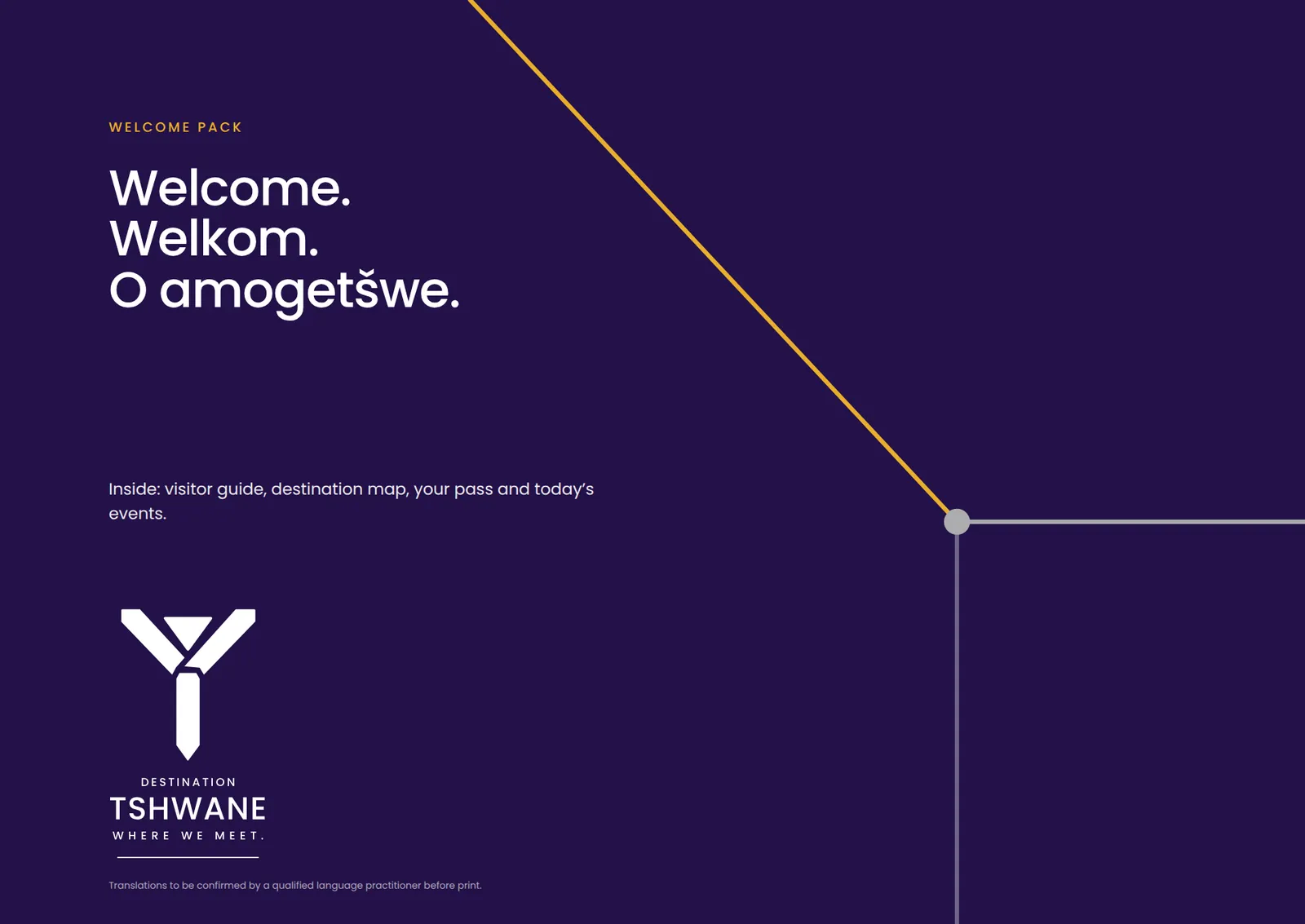
Guides, maps, cards, passes and credentials. The photograph leads; experience colour tells the visitor which story they are in.
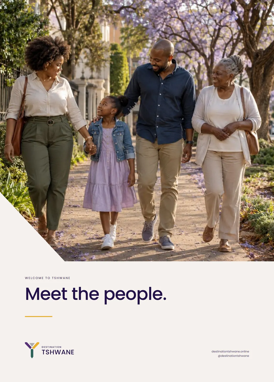
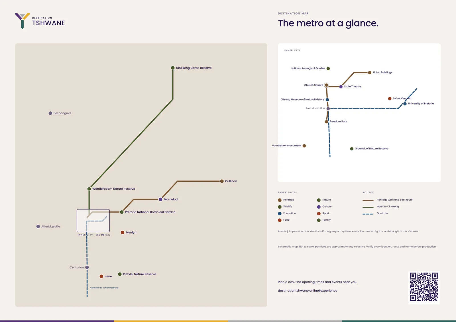
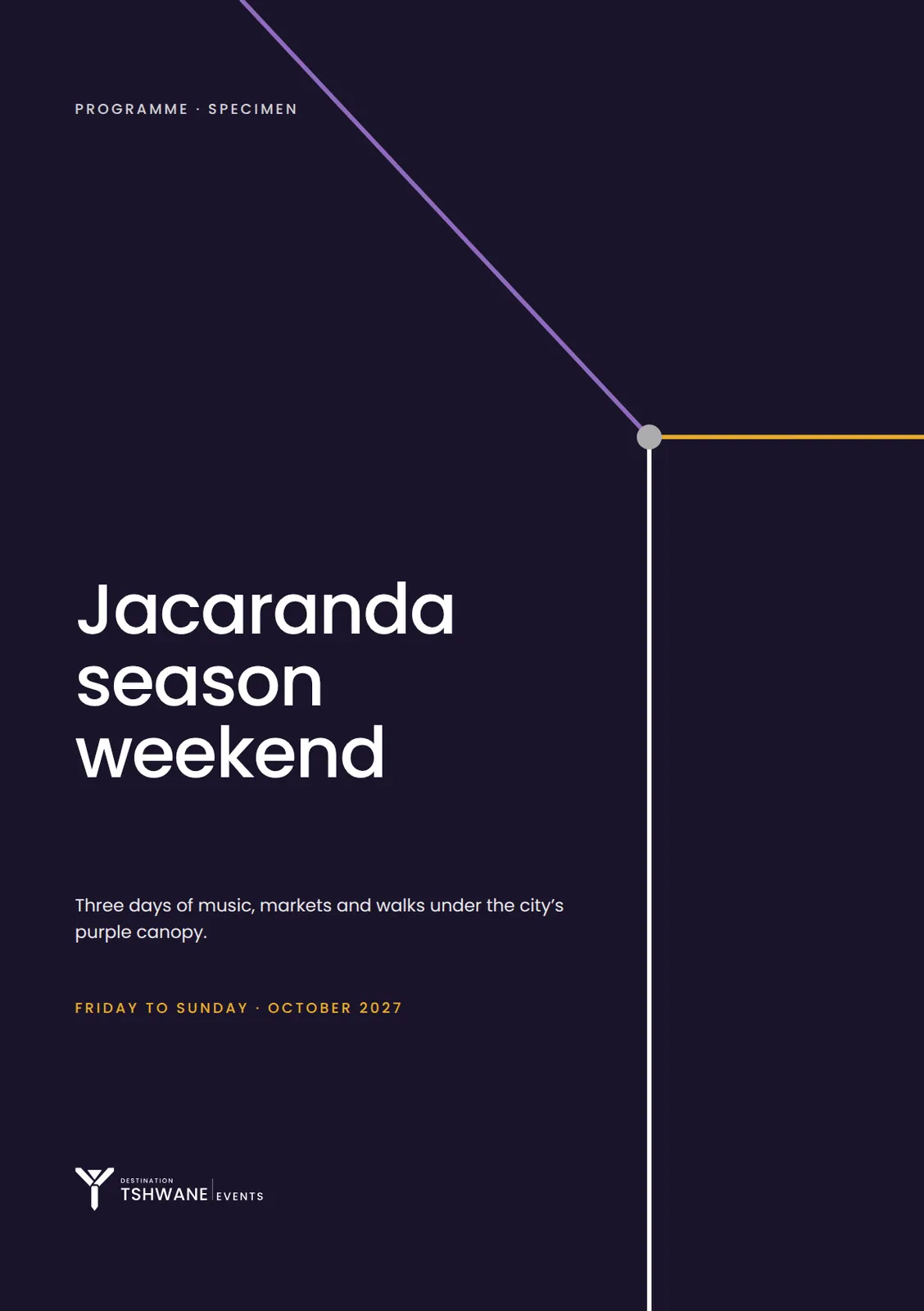
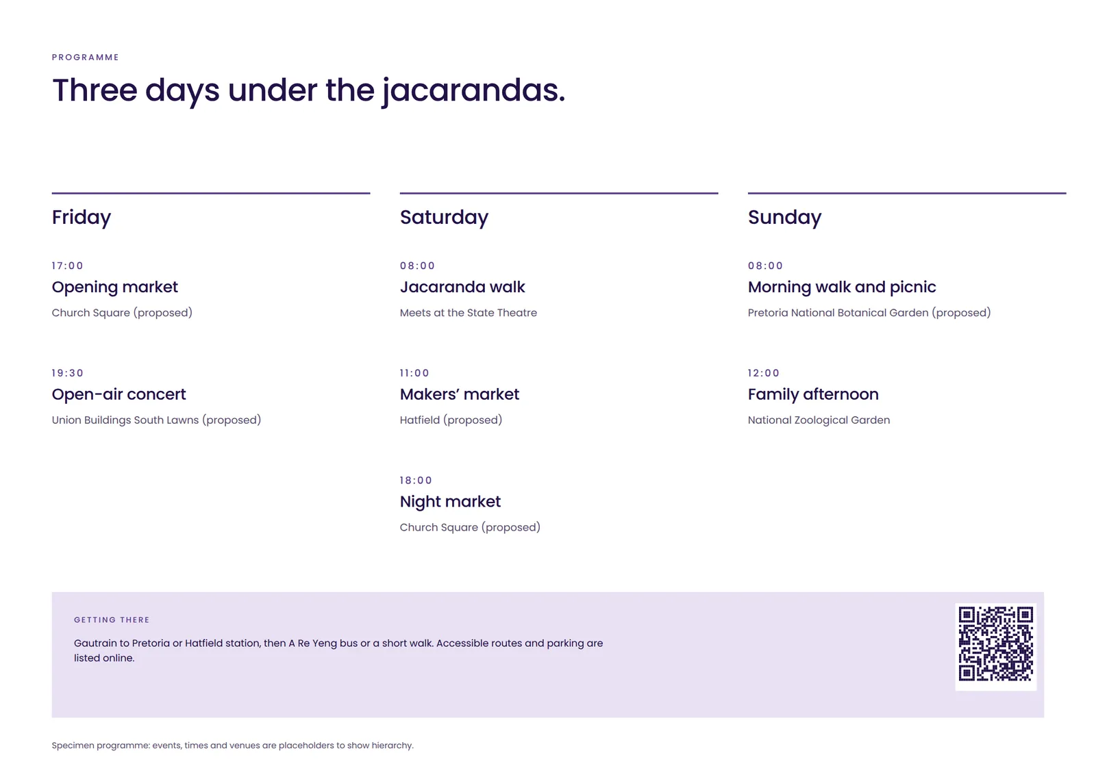
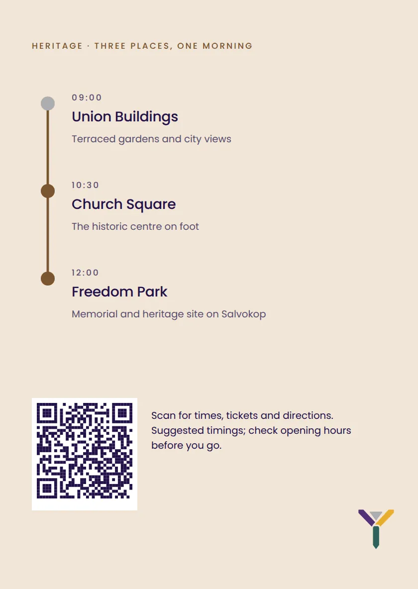
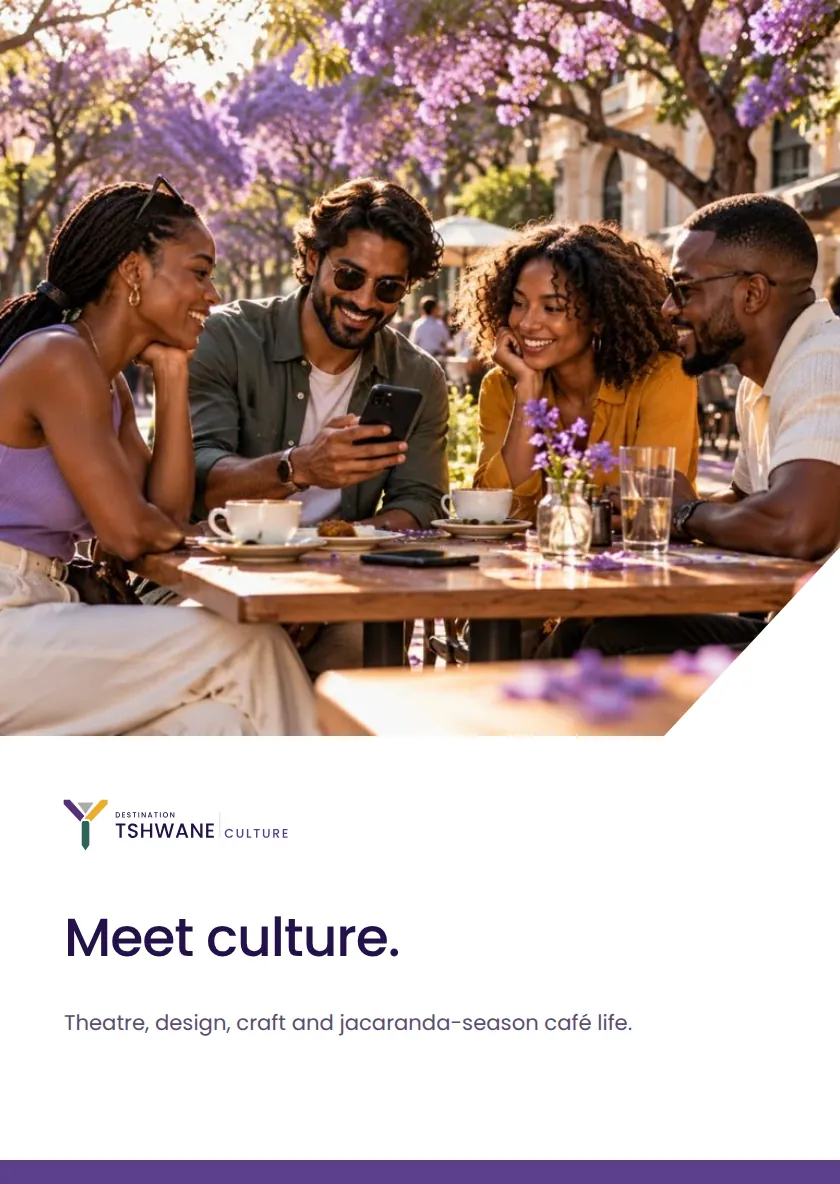

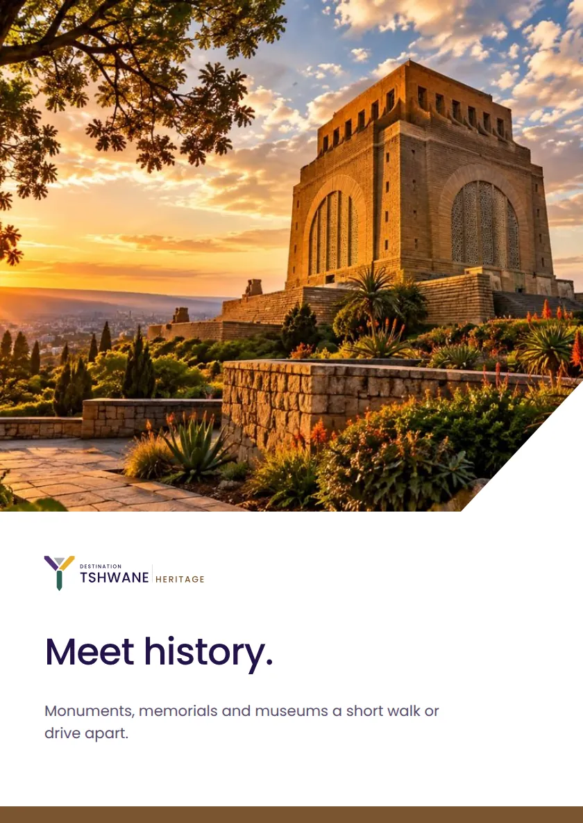
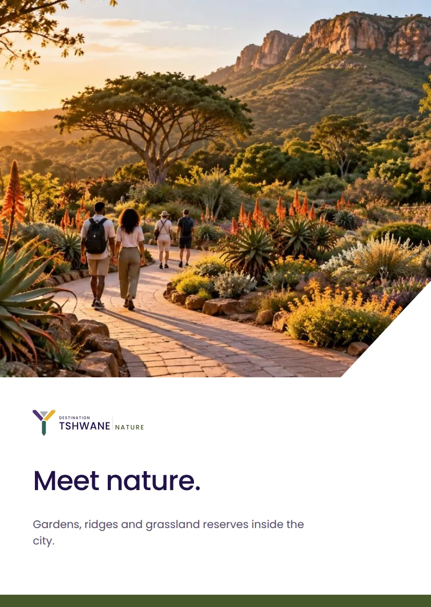
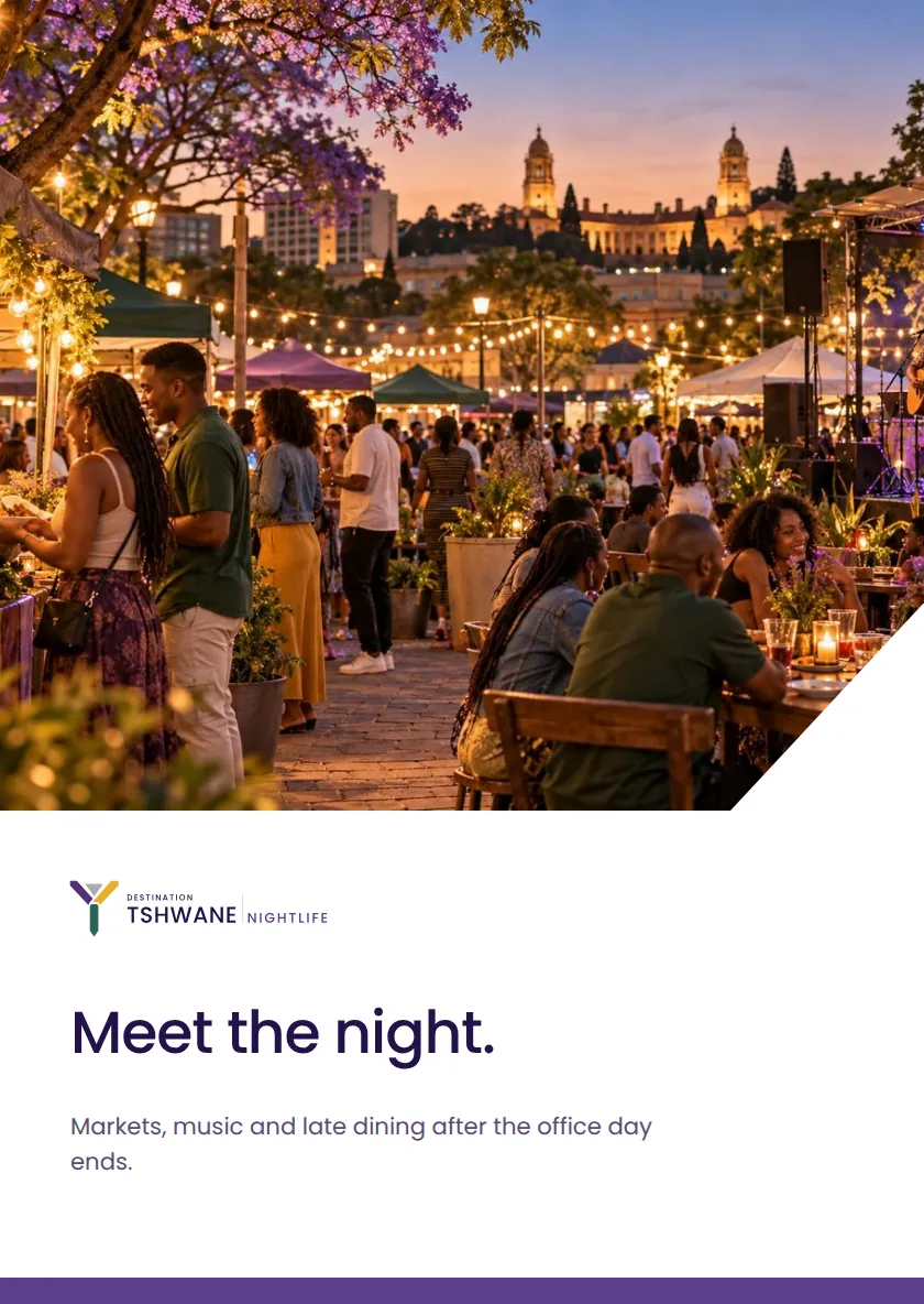
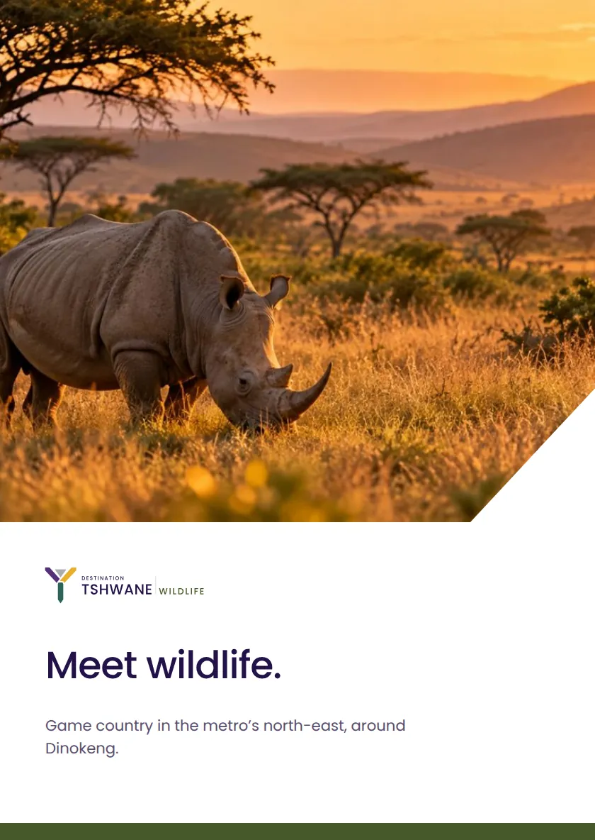
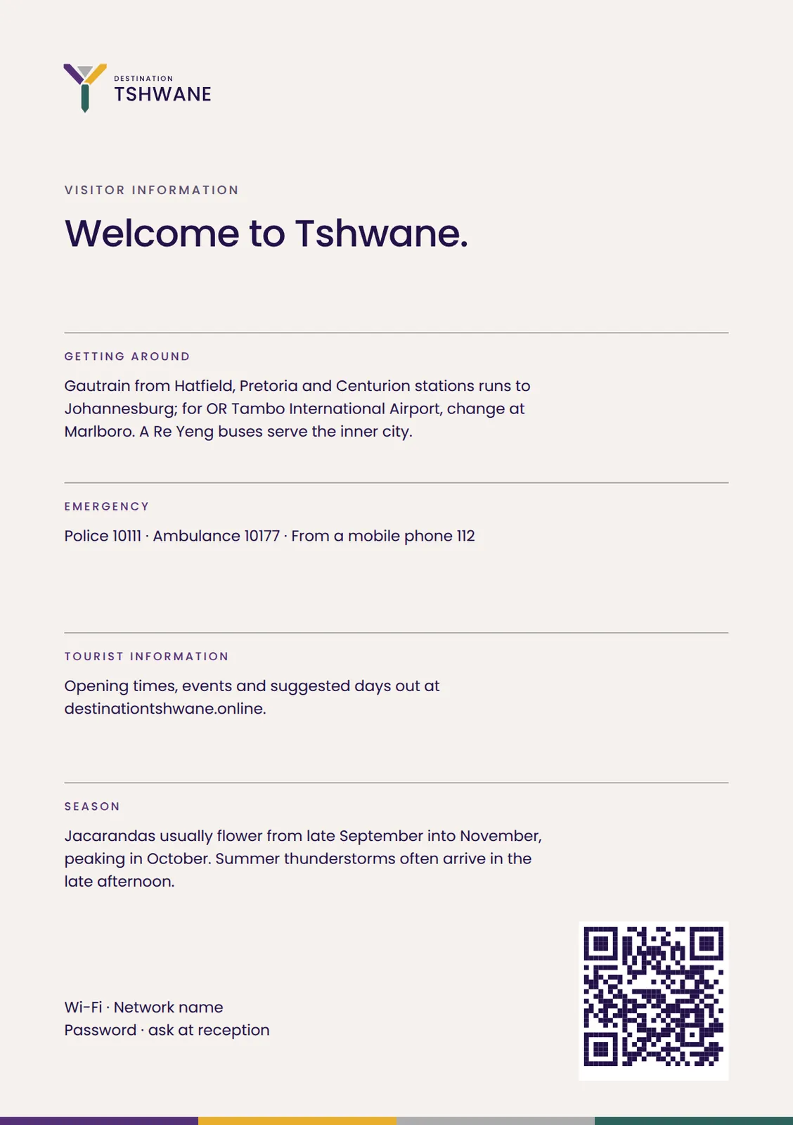
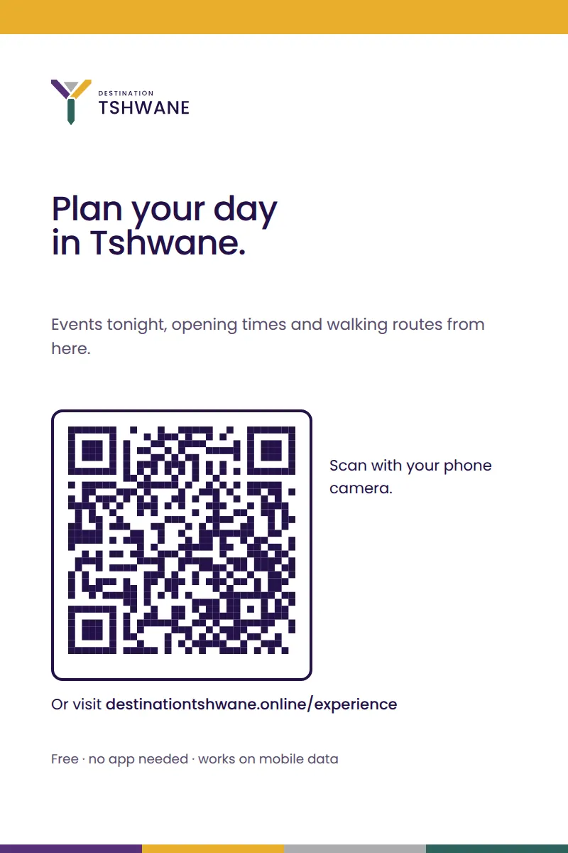
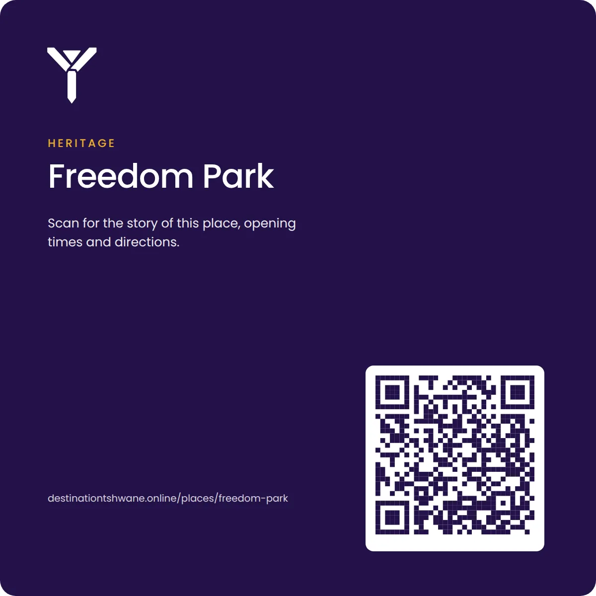
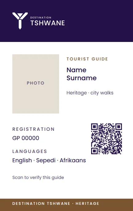
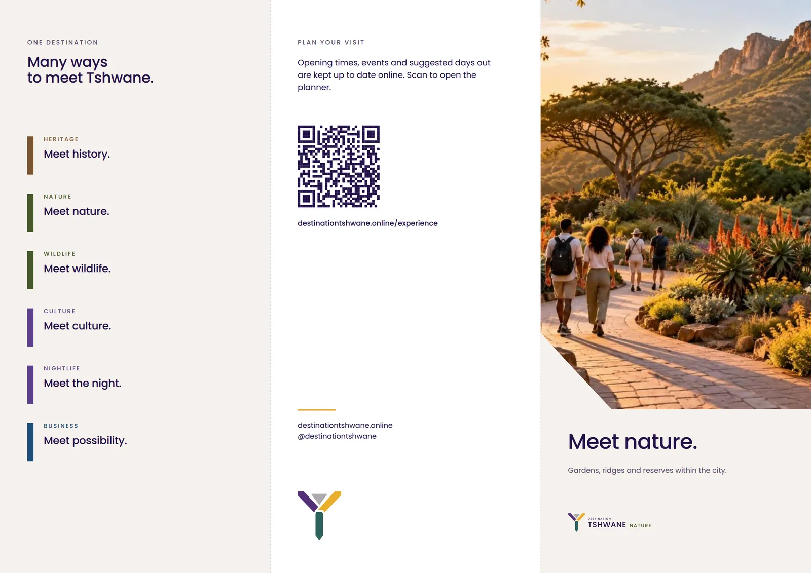
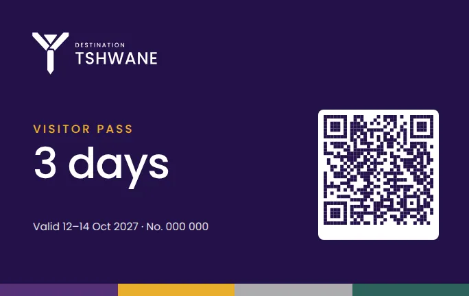
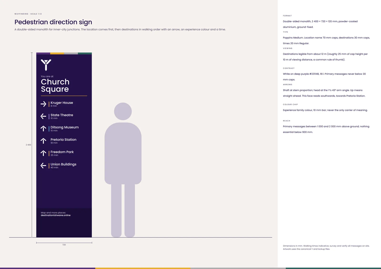
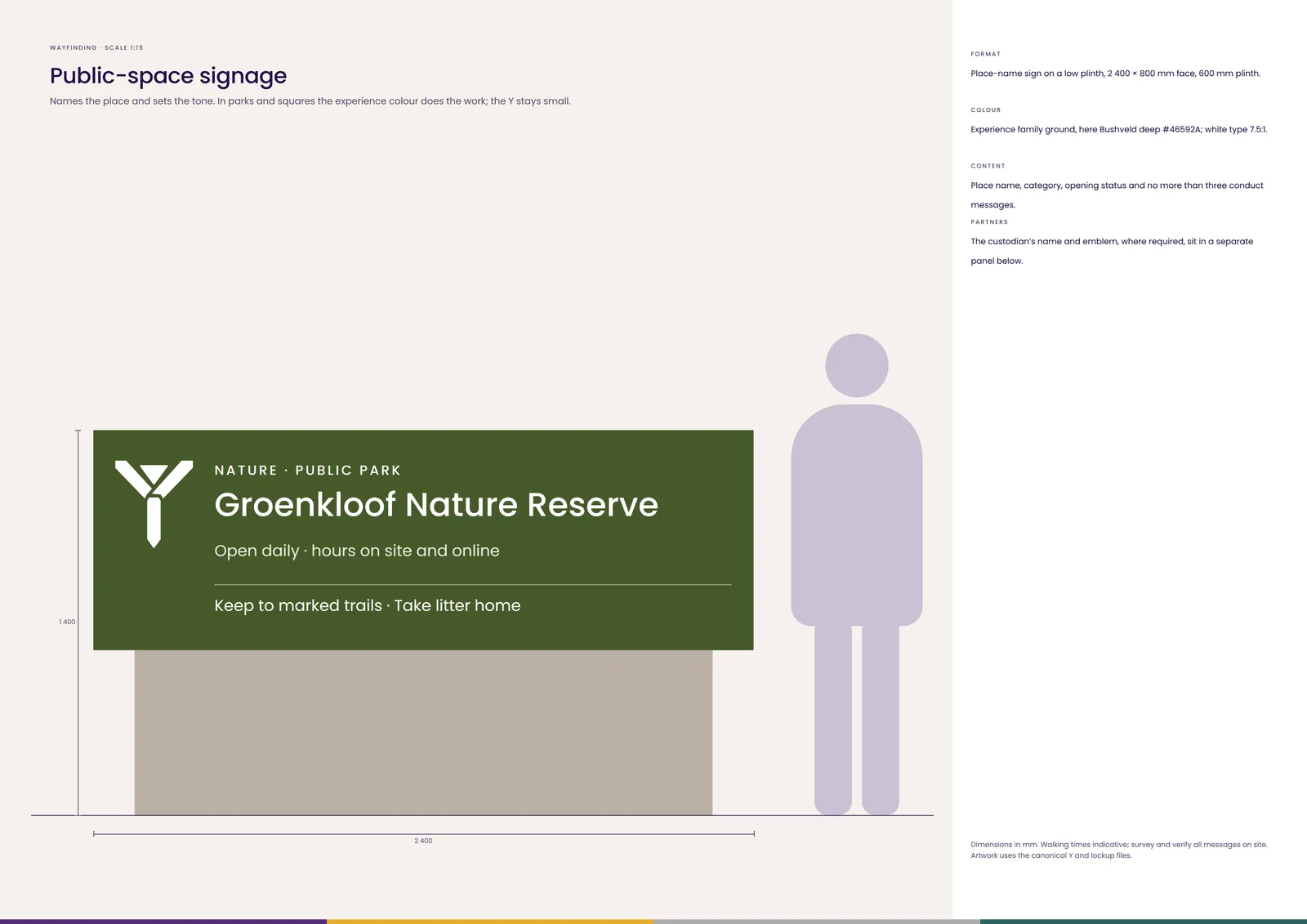
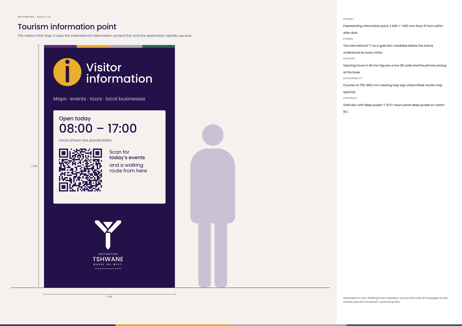
Eight sign types drawn to scale with type sizes for real viewing distances. The Y signs the network; it is never decoration.
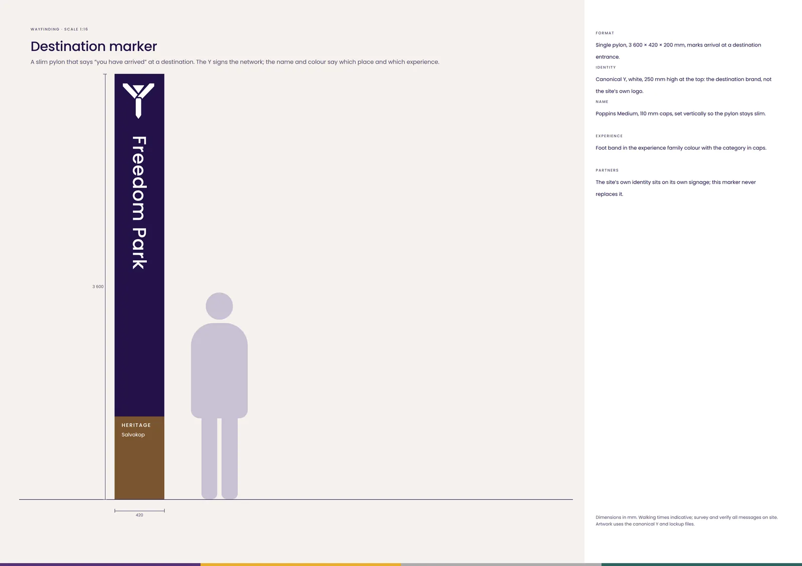
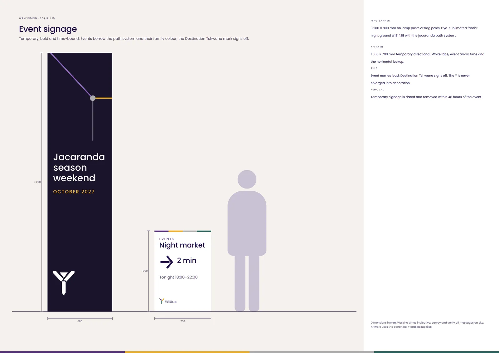
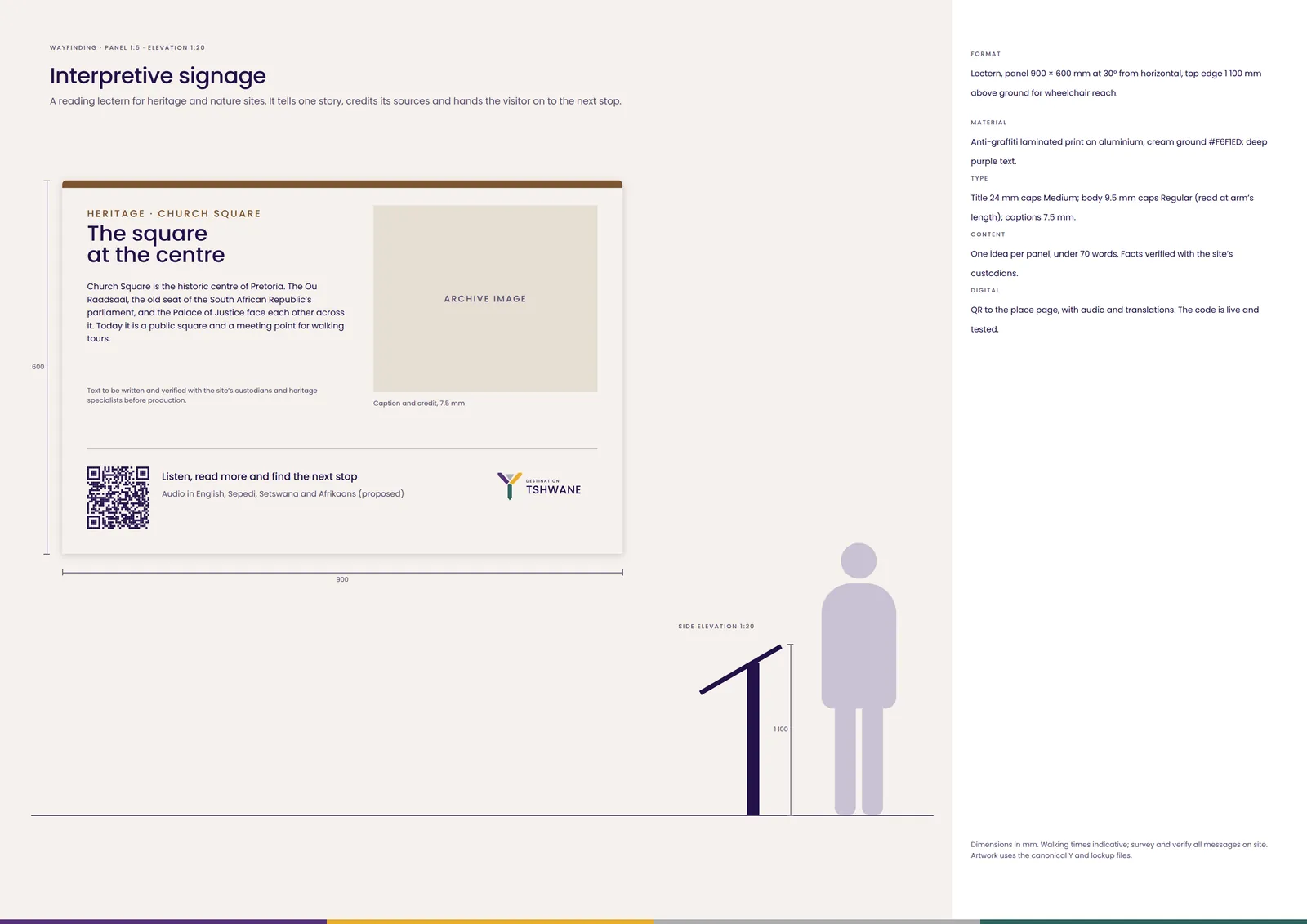
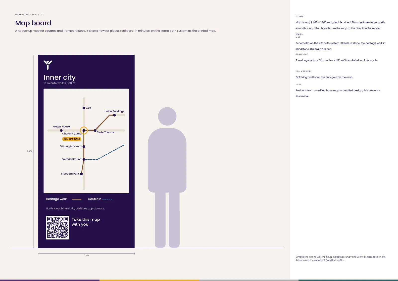
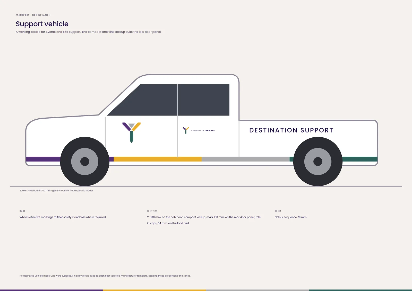
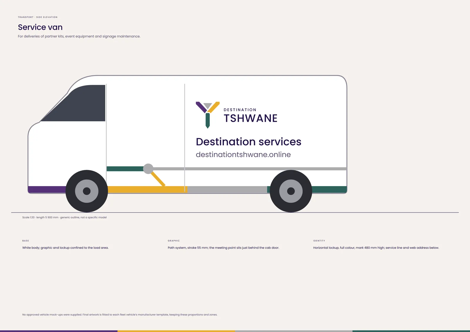
Five vehicles, one path system. Generic outlines: no vehicle mock-ups were supplied, so final artwork is fitted to each fleet template.
The commemorative system built from the approved 30 YEARS example. It sits beside Destination Tshwane, never instead of it.
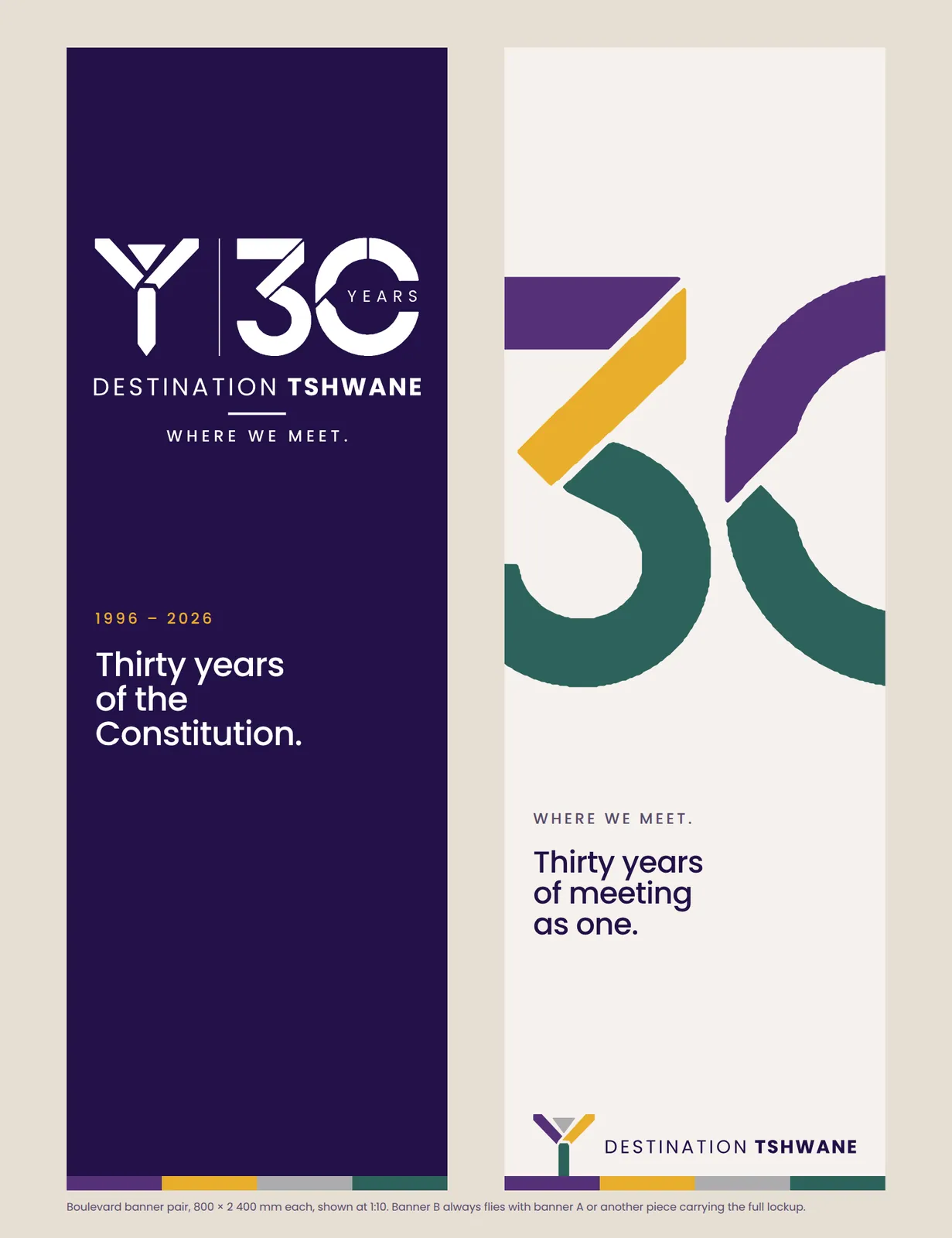
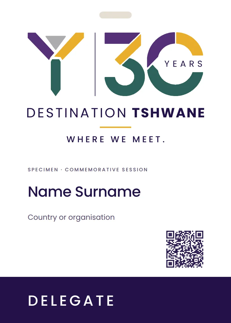
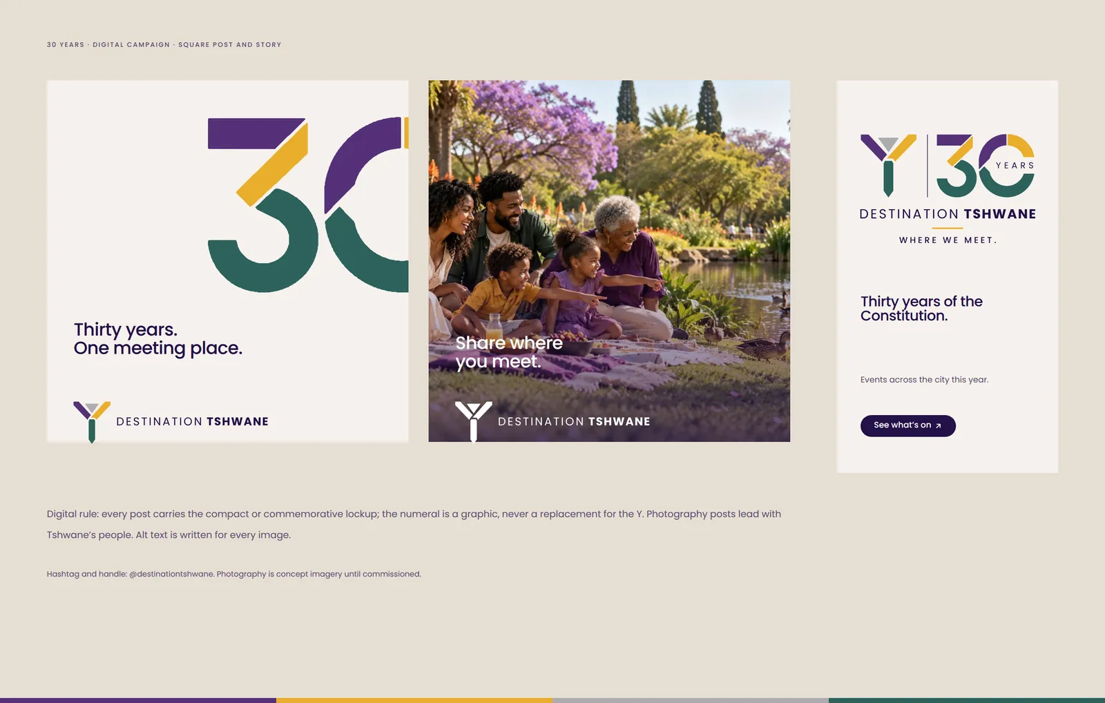
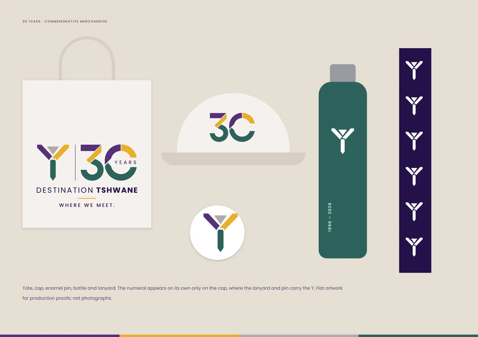
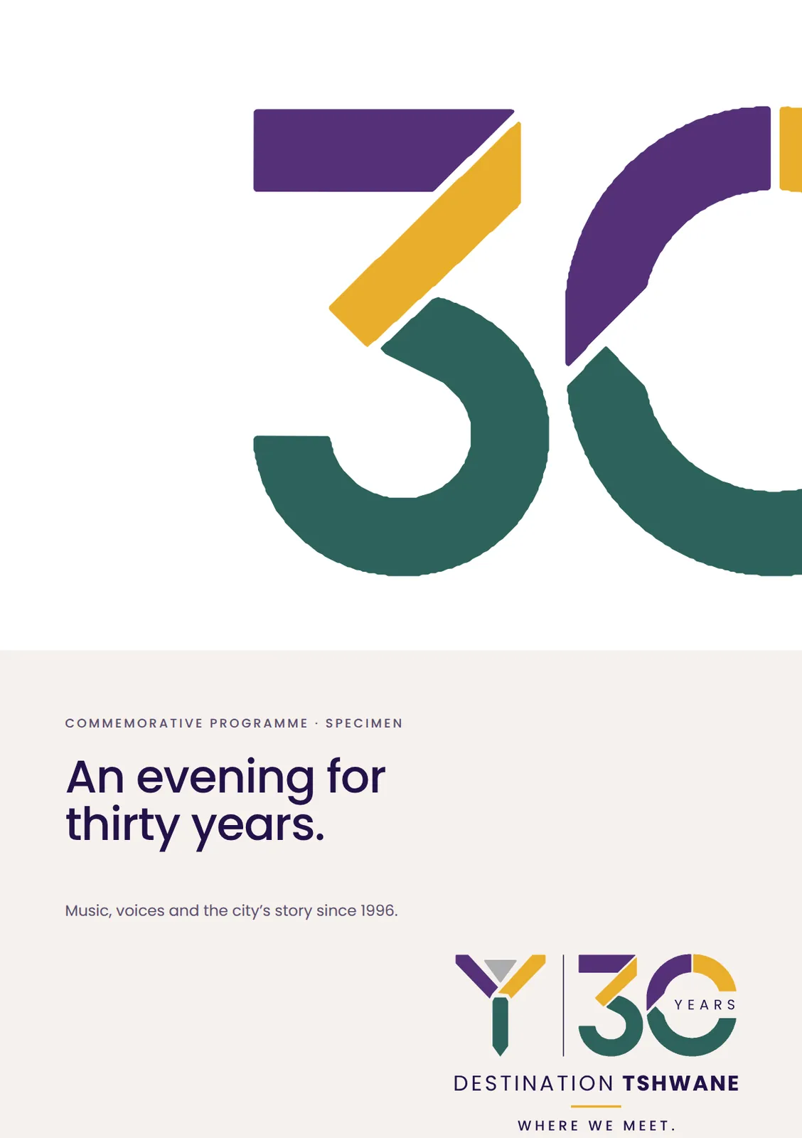
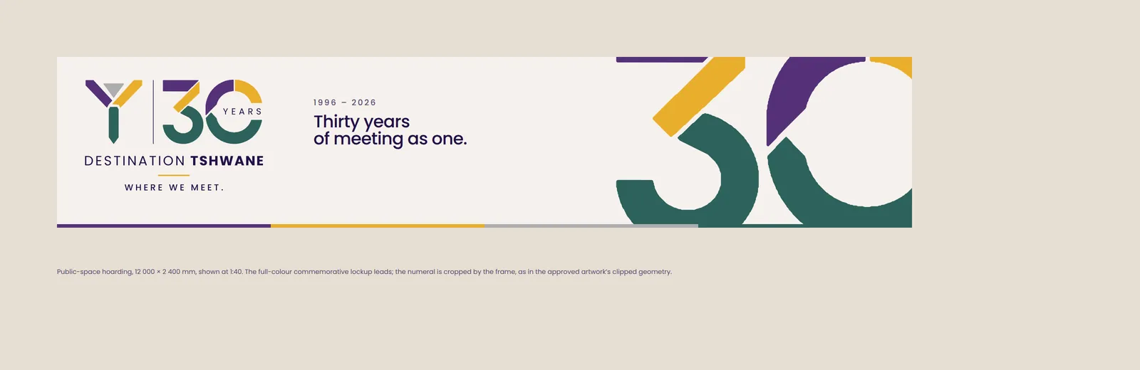
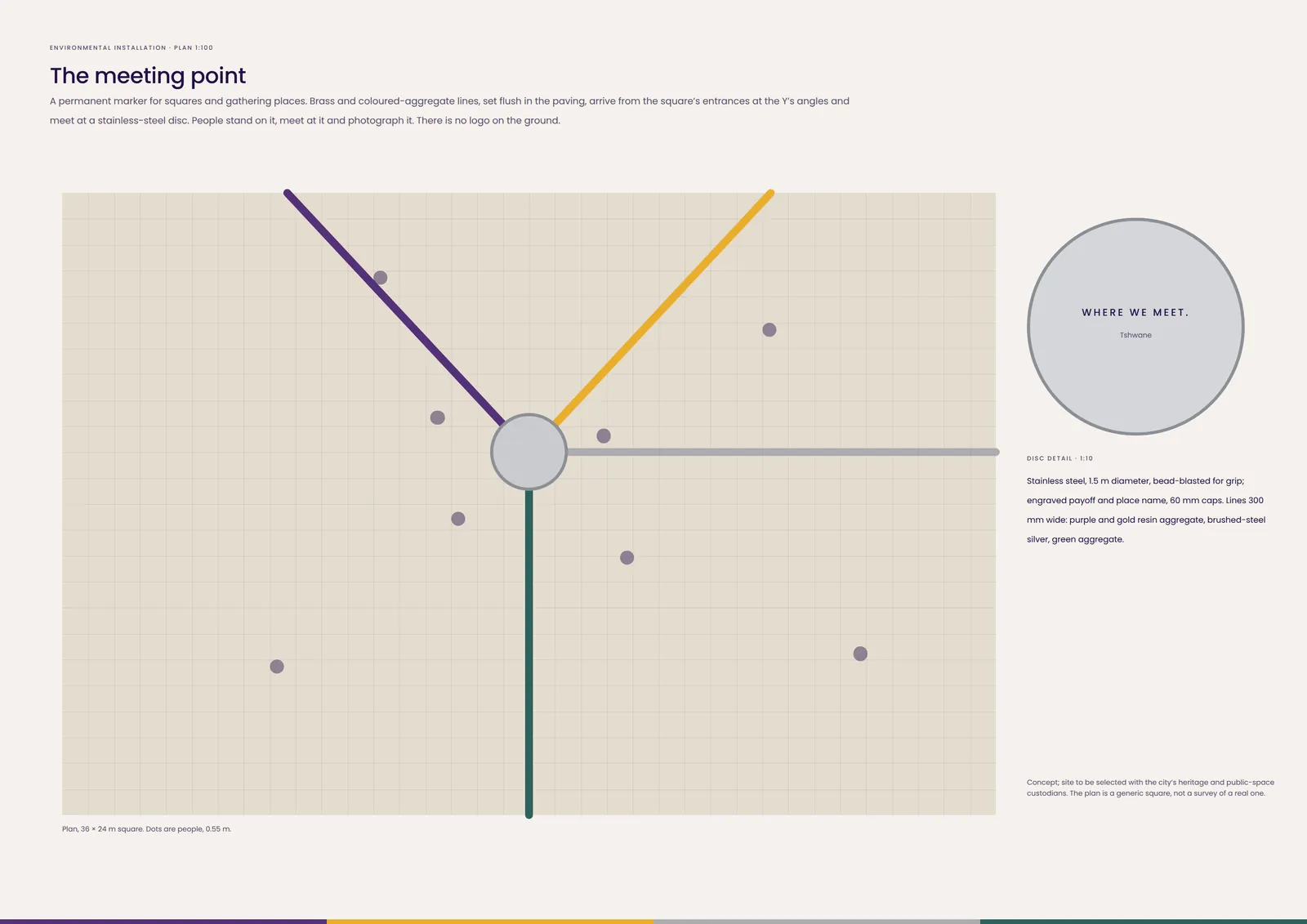
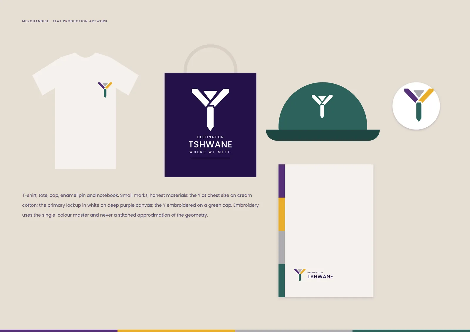
Posters, billboard, social, merchandise, a permanent meeting point and the scale test.
07 / Technical standards
Reproduction and incorrect use
SVG for every screen use; PNG only where SVG is not supported. sRGB. The favicon switches to the white colourway on dark browser chrome.
PDF or EPS vector files; CMYK from the FOGRA39 conversion on coated stock, proofed before a run. Uncoated stock and spot colours are matched physically.
Cut vinyl or print from vector only. About 25 mm of cap height per 10 m of viewing distance; verify contrast under installed lighting.
Use the single-colour master. No stitched or traced approximations.
08 / Downloads
Open and vector files
PNG and JPEG exports of every lockup, and print-ready PDFs of every application, are in the submission pack.