Observe
Landmarks, people, rivers and journeys provide a rich visual vocabulary.

Identity proposal 2026
Culture, nature and a city of many stories.
Find where yours begins.
WHERE WE MEET.

01 / The proposition
A destination identity with civic reach.
The idea. Tshwane is a meeting place, not a single landmark. The Y shows many paths arriving at one centre and moving on together.
Tshwane holds many stories. Its identity needs to make room for them.
A single landmark can describe an attraction. An organising idea can connect a destination: residents and visitors, heritage and new thinking, institutions and everyday life.
The geometric Y turns that idea into a repeatable visual behaviour. Distinct paths approach a shared centre and continue in a common direction.
Read the strategic caseLandmarks, people, rivers and journeys provide a rich visual vocabulary.
Keep the behaviour that connects them: approach, encounter, continuation.
A restrained Y holds the idea. The wider system carries the many stories.
Positioning · strategic territory
“For visitors, delegates and residents, Tshwane is South Africa’s meeting place: the capital where the country’s institutions, heritage, nature and people come together within one metro.”
For decisions and partners; not published as copy. How it was tested.
Payoff · public
WHERE WE MEET.
Short and repeatable. Campaign lines such as Meet the capital. extend it; they never replace it.
The making of the Y shows each step in new explanatory studies made in September 2026.
02 / The making of the Y
A visual case study · September 2026
Tshwane, place, connection, convergence, meeting, abstraction, the Y, where we meet. Each step says what is evidence, what is interpretation and what is design, and why the mark became simpler as it was refined.
Sources and a fact / interpretation / proposal table are in the full rationale.
01 · Tshwane
02 · Place
Rivers that run through Tshwane meet about 60 km north of Pretoria’s city centre, beyond the metro’s northern boundary. OpenStreetMap records the junction. It shows the behaviour this identity is built on: separate paths arriving at one point and leaving as one.
Real map: mapped river centre-lines from OpenStreetMap, north up, with latitude and longitude lines.
Junction · 25.174°S, 28.110°E
03 · Connection, measured
Bearing from the junction to the first mapped point 2 km away along each river. Method and values are in junction-measurements.json.
The real junction is angled and uneven. It does not look like the upright logo. Rotating it, balancing the arms and straightening the stem are design decisions, shown step by step below. The junction itself lies north of Makapanstad, outside the metro; the rivers pass through Tshwane before they meet.
The geography supplied the behaviour.
Design supplied the discipline.
04 · Convergence
“The centre lines of the band start in the top and bottom corners next to the flag post, converge in the centre of the flag, and continue horizontally to the middle of the free edge.”
Constitution of the Republic of South Africa, 1996, Schedule 1: National flag
“…can be interpreted as the convergence of diverse elements within South African society, taking the road ahead in unity.”
South African Government, National flag
The Tshwane mark is not a redraw of the South African flag.
05 · Meeting
Accounts of where the name Tshwane comes from differ. This proposal doesn’t depend on any of them, and makes no claim that the name means “rivers” or anything else.
Languages in the City of Tshwane · Census 2011
Share of residents by first language, as listed in Statistics South Africa’s City of Tshwane profile. Eleven spoken languages and Sign Language are recorded.
Internal reference
KOPANO
union · gathering · coming together
A word used in Sotho–Tswana languages, kept here as an internal reference for the idea of meeting, to be confirmed with a language specialist before any public use. It isn’t a translation of Tshwane or a proposed name.
The public proposition stays
WHERE WE MEET.
06 · Abstraction
New explanatory design studies — September 2026
Made for this proposal to show the reasoning behind the mark. They are not historical sketches from the original design process. Tap a study to look closer.
07 · The Y
Slide from the mapped rivers to the mark. Every change between them is a design decision, and the numbers show how large each one is.
08 · Where we meet
Geography
Confluence. Water. Movement.
Nation
Convergence. Unity. Forward movement.
Destination
Meeting. Arrival. Exchange.

WHERE WE MEET.
An explanatory sequence. The mark’s parts aren’t assigned to individual fields, communities or colours.
Optional · try it
Drag from each dot toward the centre, or press a dot to draw its path. Nothing here is needed to follow the proposal.
0 of 3 paths traced.
You found it.WHERE WE MEET.
03 / The identity
One mark. A clear argument.
Select a detail to read the geometry.
A mapped river junction informs the idea of convergence; the mark is a designed form, not a tracing of it. No name-origin claim is made.
A practical test
Vector geometry stays sharp at every screen size.
Digital vector reconstruction. Approve its geometry and print specifications before adopting it as the production master.
04 / The system
Built to belong in more than one place.
A consistent mark anchors the system. Colour, typography, imagery and language give each story its own register.


Rules
The final identity system
The form carries the meaning.Colour keeps the paths distinct.
Measured on the canonical master (500 × 565 units), verified against the original artwork.
Secondary lockupHeaders, banners, credentials.

Vertical lockupBanners, pylons, covers, where the payoff appears nearby.

MonochromeSingle-colour print, embroidery, engraving.
 Destination Tshwane
Favicon and app icon96, 48 and 16 px.
DESTINATIONMobile-scale mark28 px in an app header.
Brand colours · the four parts of the Y
Website colours
The colours are functional choices for contrast and recognition, adopted from the original 30-year artwork and kept for contrast. No cultural or flag meaning is attached to them. Print specifications require proofing against the final vector master.
Brand architecture · proposed

Culture

Wildlife

Education
05 / Application
Schematic studies
A vertical mark suits the places a destination is met: poles, pylons, phones and lanyards.
A capital identity should live where the capital’s business is done.
Schematic application studies drawn for this proposal. They are not photographs, real locations or approved signage. The flat arrow is the Y turned upside down.
06 / Identity in the city
Production artwork · September 2026
Transport, arrivals, signage, credentials, print and merchandise, each built from the canonical master files. See the full brand system.
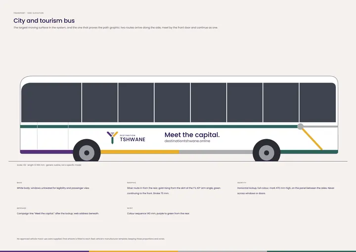
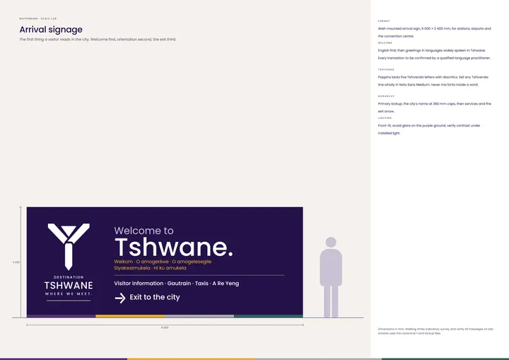
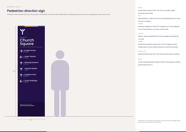
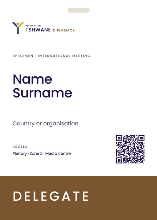
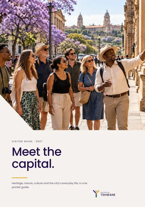
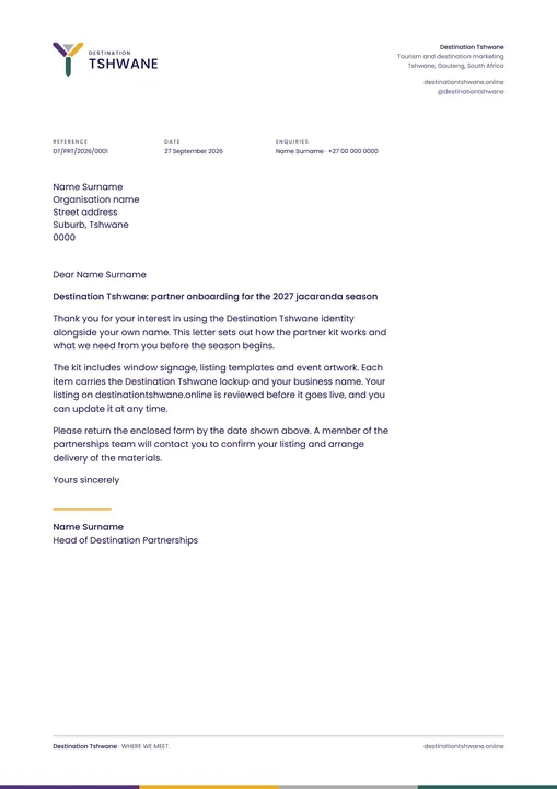

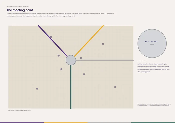
Vector artwork from the logo suite. Photographs inside the artwork are concept imagery until commissioned.
07 / People of Tshwane
Residents, visitors, makers
An identity exists for the people who use the city: friends at a café, makers at a market, families in the park, students in the lab. The photograph leads; the brand signs off.
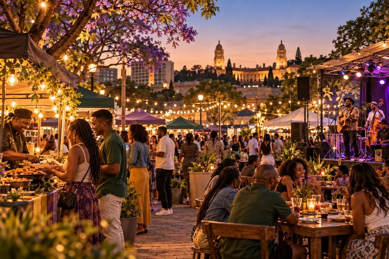
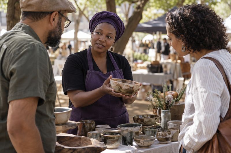


No real people, events or products are depicted.
08 / 30 Years
A temporary extension · 1996–2026
A temporary expression marking 30 years since South Africa’s Constitution was adopted in 1996. The numeral borrows the Y’s colours and clipped geometry. Presidents take the constitutional oath of office at the Union Buildings, which makes Tshwane a natural host for the anniversary. When 2026 ends, the master identity carries on unchanged.
01 · Master identityPermanent. Never replaced.
02 · SystemColour and clipped geometry, shared.

03 · 30-year expressionTemporary. Sits beside the Y, never instead of it.
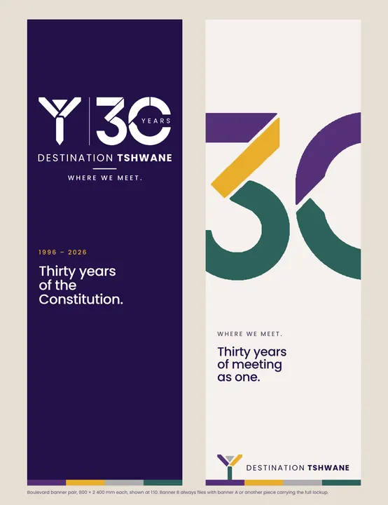
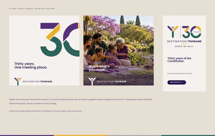
The approved 30-year example, and the commemorative system built from it: canonical Y, traced numeral, Destination Tshwane line and payoff.
09 / Economic role
The mark creates shared recognition. Its applications should help visitors discover the people and businesses behind the destination.
The identity makes the destination recognisable. The platform turns that recognition into a next step that reaches a local business.
Each question opens the visitor prototype. The first works today; the rest show what a pilot must add first, and the prototype says so.
A proposed partner kit gives small operators usable signage, listing and event templates while keeping their own names visible. Participation criteria and permission govern use.
Wayfinding and campaign materials point to a relevant operator, experience or current offer. Digital links and QR codes should lead directly to useful information.
Test recognition, count active participating businesses and measure enquiries from campaign touchpoints. Do not present visual impressions as visitor spend.
How success is measured · proposed
Rollout Validate 90-day pilot partner service transactions
10 / The case for adoption
Why adopt it: